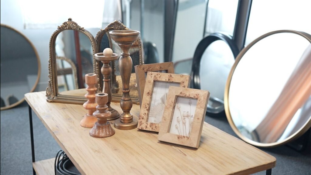
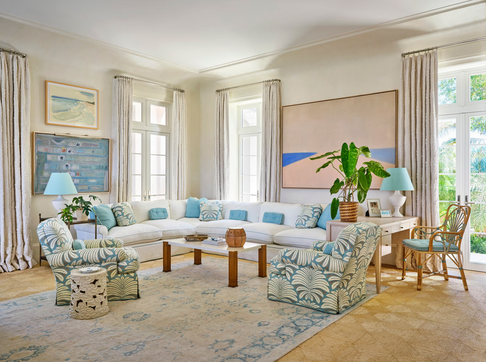
Teruier is developing a new color direction for its 2027 spring home décor program, exploring how warm neutrals, muted pastels, and expressive accent colors can work across coordinated retail collections.
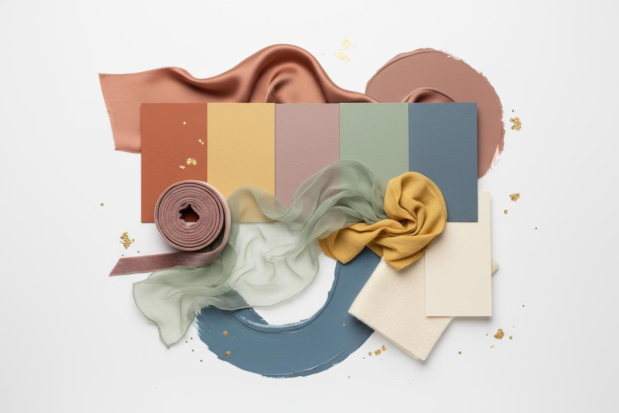
The development plan includes 15 proposed designs: 10 single-color concepts and five two-tone concepts, with color directions ranging from creamy white and mushroom taupe to terracotta pink, misty blue-gray, muted olive, and soft yellow.
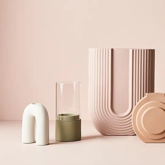
For U.S. retail buyers, the objective is not simply to introduce more colors. It is to create home décor assortments that combine recognizable design trends with practical product selection, materials, and merchandising considerations.
What Is Changing in 2027 Home Décor Colors?
The emerging 2027 color landscape suggests a balance between familiar, nature-inspired tones and more expressive accents.
In its Spring/Summer 2027 color forecast, WGSN and Coloro identified Luminous Blue, Energy Orange, Pop Pink, Meadowland Green, and Clay as key directions.
Meanwhile, Benjamin Moore announced Webster Green as its 2027 Color of the Year, alongside a palette combining soft neutrals, muted blues, warm browns, and gentle pinks.
At Fall 2026 High Point Market, ANDMORE’s Market Snapshot also highlighted warm retro influences, earthy neutrals, and natural textures.
These signals do not mean every forecast color will become a retail bestseller. They do, however, offer useful starting points for suppliers and product development teams planning future assortments.
From Color Trends to Teruier’s 2027 Spring Development Direction
Teruier’s proposed spring palette emphasizes colors that can be coordinated across different home furnishings categories.
Rather than applying every trending shade to every product, the development approach considers three practical color roles.
| Color Direction | Proposed Palette | Retail Assortment Role |
|---|---|---|
| Foundation Neutrals | Creamy white, mushroom taupe, gray olive | Flexible core pieces |
| Soft Seasonal Colors | Terracotta pink, misty blue-gray, lavender | Coordinated spring accents |
| Expressive Accents | Butter yellow, apricot orange, burgundy | Selected statement products |
The intention is to give buyers flexibility when planning a collection.
A muted blue-gray decorative piece, for example, could coordinate with a creamy white vase or a neutral upholstered accent. A brighter yellow or orange item might serve as a focal point without requiring an entire assortment in the same color.
The planned five two-tone concepts offer another design opportunity: introducing contrast within individual products while maintaining a consistent overall collection.
These remain development directions rather than confirmed production specifications.
Why Different Materials Need Different Color Decisions
One challenge in coordinated home décor development is that the same color behaves differently across materials.
A warm neutral on glazed ceramic will not necessarily look identical on upholstery, painted wood, or a metal finish.
For Teruier’s development process, this makes material selection as important as the color name itself.
Consider several potential applications:
- Ceramic décor: Surface gloss, glaze appearance, and sculptural shape influence how a color is perceived.
- Upholstered furniture: Fabric weave, texture, and pile can change the visual depth of muted or saturated colors.
- Decorative storage: Color placement and material combinations can help distinguish coordinated products without making them identical.
Buyers can explore Teruier’s existing tabletop décor collection and upholstered furniture collection as references for potential category applications.
Before a proposed color moves into production, physical samples and approved finish references should be used to evaluate how the design performs across materials and lighting conditions.
Building a Collection, Not Just Adding New SKUs
For U.S. category managers, the commercial question is how a new color direction fits into an existing retail assortment.
A practical collection might use foundation neutrals for its core items, muted colors for coordinated supporting products, and a smaller number of expressive accents for visual interest.
This approach can help retailers evaluate assortment relationships without depending entirely on one seasonal shade.
Teruier’s product development model connects market research and design collaboration with manufacturing resources in Fuzhou and Minhou, China.
The important decisions include selecting suitable materials, defining product proportions, planning surface finishes, and assessing whether a concept can be manufactured and packaged consistently.
This process becomes particularly valuable when different product categories need to share a visual direction without sharing identical construction or production methods.
Next Steps for the 2027 Spring Program
Teruier’s proposed 2027 color concepts provide a starting point for product development discussions with retail and wholesale partners.
The next decisions involve defining which colors belong to specific product categories, reviewing material and finish options, and identifying which concepts justify physical sampling.
For buyers who are comparing existing products with new development opportunities, Teruier’s wholesale home décor catalog and sample review guide explains how catalog selections can move toward sample evaluation.
FAQ
What colors is Teruier exploring for spring 2027?
The proposed directions include creamy white, mushroom taupe, terracotta pink, misty blue-gray, gray olive, butter yellow, apricot orange, burgundy, and lavender, with both single-color and two-tone concepts.
Can U.S. buyers request different colors for private-label collections?
Buyers can discuss preferred palettes, color combinations, finishes, and product categories with Teruier. Actual customization depends on material suitability, sample approval, manufacturing feasibility, and commercial requirements.
Discuss Your 2027 Home Décor Collection With Teruier
For U.S. retailers, importers, and home décor brands preparing future assortments, a successful color program begins with clear product and merchandising decisions.
Teruier welcomes discussions about spring color directions, coordinated product development, custom finishes, and private-label home décor programs.
Contact Teruier to share your 2027 collection brief or explore potential product development opportunities.