Price Is Easy to Quote. Finish Quality Is Harder to Fake.
A lot of sourcing conversations start too late.
They start with price.
Not with finish consistency.
Not with material behavior.
Not with how a product will actually look under store lighting, in a styled setting, or after repeated handling.
That is usually where buying mistakes begin.
Because in home decor, two products can look similar in a photo, come with roughly similar measurements, and still perform very differently once they reach the shelf. The difference is often not the basic form. It is the finish.
A mirror frame with the wrong metallic tone can make the whole item look cheaper.
An ottoman fabric with the wrong surface texture can kill the room story.
A ceramic glaze with unstable variation can turn reorder into an argument.
That is why experienced buyers often learn the same lesson:
compare finishes first, then compare prices.
What Buyers Are Really Comparing
When buyers compare materials and finishes, they are not just comparing appearance.
They are usually comparing five things at once:
- perceived value
- finish stability
- assortment fit
- damage visibility
- reorder confidence
That is why a lower quote does not always mean a better buy.
Sometimes the cheaper finish creates more problems later:
- it photographs worse
- it looks flat under retail lighting
- it shows scratches faster
- it feels less coordinated with the rest of the range
- it becomes difficult to reproduce consistently
In other words, you may save on unit cost and lose on sell-through, presentation, and second-order confidence.
That is not a cheaper product.
That is a more expensive mistake.
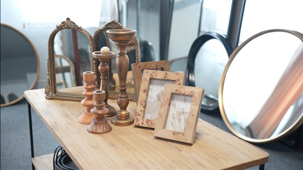
Mirrors: Small Finish Differences Create Big Price Perception Differences
Mirror buyers know this better than most.
With mirrors, finish quality changes the product faster than most other adjustments. A slight shift in metallic warmth, gloss level, edge treatment, or wood stain depth can move the whole piece up or down in perceived value.
That is why mirror finishes should never be judged only by color name.
“Gold” is not one finish.
“Black” is not one finish.
“Bronze” is not one finish.
Buyers should compare:
- gloss versus low-gloss behavior
- brushed versus polished effect
- warm versus cold undertone
- how the finish reacts around corners and joints
- whether the frame looks architectural, decorative, or mass
A brushed metal mirror frame often works better than a harsh high-shine alternative because it gives buyers something useful: softness, tolerance, and broader styling range.
It feels elevated without becoming too stiff.
That matters in real retail.
Ottomans: Fabric Texture Usually Matters More Than People Admit
Ottoman buying mistakes often happen when people talk too much about color and not enough about texture.
Color gets attention first.
Texture decides whether the product can live with everything else.
A textured neutral ottoman usually has stronger commercial range than a flat fabric in a trendy color. Why? Because the texture helps build depth without forcing the customer into one narrow room style.
When comparing ottoman upholstery materials, buyers should look at:
- surface depth
- softness versus structure
- whether the fabric reads premium in photos
- how easily it pairs with wood, metal, mirrors, and ceramics
- whether the pattern or weave makes the piece easier or harder to place
A good ottoman finish does not have to be loud.
It just has to make the rest of the assortment easier to sell.
That is why woven textures, bouclé-like surfaces, small-scale pattern effects, and restrained tactile fabrics often beat louder decorative treatments in broad retail environments.
They do not just look nice.
They work harder.
Ceramics: Glaze Is Where “Handmade Feel” Either Wins or Falls Apart
Ceramic decor creates another kind of finish challenge.
Here, variation can be a strength. It can also be a disaster.
A good ceramic glaze finish gives the product life.
A bad one creates inconsistency the buyer cannot defend.
That is why ceramic comparison should go beyond “matte or glossy.” Buyers should look at:
- tonal depth
- glaze transition
- edge control
- body-to-glaze harmony
- whether variation feels intentional or random
Matte ceramic decor, reactive glazes, brushed finishes, and soft tonal surfaces often work well because they create shelf character without looking artificial.
But they still need control.
A ceramic finish should feel alive, not sloppy.
That is the whole line.
The best ceramic suppliers understand this. They do not hide behind the word “handmade” when the real issue is unstable execution.
A Better Way to Compare Materials and Finishes
Here is a more useful comparison framework for buyers:
| Category | What to Compare First | What Good Looks Like | What Usually Goes Wrong |
|---|---|---|---|
| Mirrors | Undertone, gloss level, edge finish, surface consistency | Refined finish that lifts price perception and fits multiple room styles | Finish too shiny, too cold, or too flat |
| Ottomans | Texture depth, fabric hand-feel, styling flexibility, photo-read | Upholstery that adds warmth and layers easily across collections | Fabric too plain, too trendy, or too hard to coordinate |
| Ceramics | Glaze control, tonal variation, surface depth, finish continuity | Character-rich finish with controlled variation and clear shelf presence | Variation feels random or cheap rather than crafted |
This is the comparison that matters before price sheets enter the conversation.
Why “工艺品之乡” Still Matters in Finish Development
At Teruier, this is where the idea of 工艺品之乡, a real craft-centered manufacturing base, becomes important in practical terms.
Because finish development is not just about choosing a sample from a board.
It is about knowing how materials behave in production.
How metal reacts to brushing and plating.
How fabrics change the feel of a seat shape.
How ceramic glazes behave across batches, temperatures, and forms.
When that knowledge sits close to the making process, finish decisions get better.
Not because “craft” sounds romantic.
Because fewer details are being guessed from far away.
A finish becomes more reliable when the people shaping it understand both the design intent and the production consequence.
That is where buyers get something real:
not just more options, but better judgment.
Why Interior Designers and Buyers Should Care About Finish Coordination
For interior designers, retail buyers, and sourcing teams, finish comparison is really about coordination.
A finish does not live alone. It enters a space, a shelf, a mood board, or a mixed-material assortment.
That is why materials and finishes for interior designers should be judged by relationship, not isolation.
Ask:
- Does this mirror finish fight or support the ceramic tones nearby?
- Does this ottoman texture soften the hard surfaces in the range?
- Does this glaze add rhythm or just more visual noise?
- Does this collection feel layered, or just crowded?
A strong assortment is usually not built from individually loud products.
It is built from products that know how to speak to each other.
Finishes are the language.
FAQ: Comparing Materials and Finishes Before Price
Why compare finishes before prices?
Because finish affects perceived value, coordination, quality perception, and reorder confidence. A cheaper finish can create more downstream problems than it saves upfront.
What matters most in mirror frame finishes?
Undertone, sheen, brushing quality, and finish consistency across visible edges and joints.
What should buyers look for in ottoman upholstery materials?
Texture depth, styling flexibility, how the fabric photographs, and whether it supports a wide range of interiors.
How much glaze variation is acceptable in ceramic decor?
Enough to feel crafted, not so much that each piece looks unrelated. Variation should feel intentional.
Are matte finishes always more commercial?
Not always. Matte often feels easier to place, but the better finish is the one that fits the product role, target customer, and assortment logic.
Why do two similar-looking products perform differently in stores?
Because small differences in finish quality, tone, and coordination can change how premium, usable, and trustworthy the product feels.
Final Thought
A lot of suppliers can quote a number.
Fewer can help buyers judge why one finish will hold value better than another.
That is the real comparison.
Not just what the product costs today.
But what the finish lets the product become once it reaches the shelf, enters a collection, and faces the second order.
The smartest buyers know price matters.
They just know it is not the first question.
The first question is this:
Does the finish make the product easier to sell, easier to place, and easier to trust?
That is where good buying starts.