
The Finish Sells First: Why Buyers Don’t Really Buy “Materials,” They Buy Confidence
What “Materials & Finishes” Actually Means in Home Decor
Let’s get one thing straight: buyers rarely fall in love with raw material alone.
They don’t buy metal. They buy the way brushed metal looks under store lighting.
They don’t buy ceramic. They buy the glaze that makes a shelf feel curated instead of crowded.
They don’t buy upholstery. They buy the texture that looks expensive before anyone even touches it.
That is the real meaning of materials and finishes in home decor.
A material is the body. A finish is the message.
And in retail, especially in broad-appeal home decor, the message usually matters first.
A black metal mirror frame, a softly textured ottoman, and a reactive-glaze ceramic vase may belong to different product families, but they are solving the same commercial problem:
How do you create visual value fast, keep the spec stable, and make reorder easier?
That is where smart buying starts.
Why Buyers Across Categories Keep Coming Back to the Same Finish Logic
When you look across mirrors, ottomans, and ceramic decor, one pattern becomes obvious:
The most commercially useful finishes are rarely the loudest.
They are the ones that balance three things at once:
- visual appeal
- perceived value
- operational stability
In plain English: the best finish is not the most dramatic one in the sample room.
It is the one that still looks right in a carton, on a shelf, in a photo, under warm lighting, and in a reorder conversation six months later.
That is why certain finishes keep outperforming across categories:
- brushed, matte, and softly aged metal finishes in mirrors
- textural but easy-to-style upholstery finishes in ottomans
- layered glaze, hand-feel texture, and tonal surfaces in ceramics
These finishes do something very important:
they create style without making the product too narrow.
And that matters because narrow taste may win attention, but broad usability wins purchase orders.
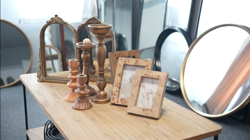
Mirrors: Finish Is Often the Fastest Way to Change Perceived Price
With mirrors, buyers are not only evaluating shape. They are evaluating how the frame finish shifts price perception.
A well-chosen finish can make a simple silhouette feel more premium, more architectural, or more retail-ready without completely rebuilding the product.
In today’s commercial reality, mirror finishes tend to work best when they do one of the following:
- warm up the piece
- soften reflection-heavy coldness
- hide minor wear and handling better
- feel elevated without becoming too formal
That is why brushed champagne, muted bronze, warm black, dark wood tones, and other softened metallic or low-gloss finishes usually have stronger range potential than ultra-polished, high-shine treatments.
Highly reflective glamour can look impressive in isolation.
But in many retail environments, it becomes risky fast. It fingerprints easily. It can feel trend-fragile. It often narrows the customer base.
A commercially strong mirror finish should say:
“I look expensive, but I’m not difficult.”
That sentence has probably saved more purchase decisions than most trend decks.
Ottomans: Texture Beats Noise More Often Than Color Does
Ottomans play a different game. Here, finish is less about reflection and more about touch, softness, and visual comfort.
But the same buying rule still applies: buyers are not just choosing fabric. They are choosing how easily that fabric enters a room story.
The safest winners are usually not flat basics, but they are also not hyper-specific statement fabrics.
The sweet spot is often:
- tactile neutrals
- performance-minded textures
- small-scale pattern play
- finishes that photograph well and layer easily with other goods
That is why soft bouclé-like textures, structured woven fabrics, faux suede looks, and restrained stripe or grid effects often outperform louder prints in broad retail settings.
Big pattern can create buzz.
Small pattern creates placement flexibility.
And flexibility is commercial oxygen.
An ottoman finish has to work with rugs, benches, side tables, wood tones, and changing seasonal accessories. If the surface fights everything around it, the product may get admired but not reordered.
For ottomans, the best finish often does not scream.
It quietly helps the whole assortment make sense.
Ceramic Decor: The Finish Is the Story
Ceramic decor may be the clearest example of finish doing the heavy lifting.
Because with ceramics, the form matters, yes.
But glaze, texture, edge treatment, and surface depth often determine whether the piece feels handmade, giftable, collectible, whimsical, elevated, rustic, or mass.
That is a lot of work for one surface.
The ceramic finishes that usually travel best in commercial assortments tend to have one or more of these qualities:
- tonal depth
- visible hand-feel
- soft irregularity
- natural or food-inspired warmth
- enough variation to feel alive, but not so much that it becomes unstable
This is why matte ceramics, reactive glaze, brushed glaze transitions, chalky surfaces, soft gloss accents, and artisanal-looking texture often outperform flat, overly synthetic-looking finishes.
The goal is not perfection in the sterile sense.
The goal is controlled character.
Buyers do not mind a ceramic piece having personality.
What they mind is when “personality” turns into inconsistency that cannot be explained to stores, merchandisers, or customers.
In ceramics, finish is not decoration.
It is the product narrative.
A Simple Comparison: What Different Finishes Are Really Doing
| Category | Finish Type That Often Works | Why It Sells | Common Risk |
|---|---|---|---|
| Mirrors | Brushed metal, warm black, softened bronze, dark wood, low-gloss frame treatments | Lifts price perception, broadens styling range, hides handling marks better | Over-polished or overly trendy finishes can narrow appeal |
| Ottomans | Textured neutrals, woven surfaces, restrained small-scale pattern, tactile upholstery | Adds warmth, layers easily, photographs well, supports broad room placement | Loud pattern or overly niche texture reduces versatility |
| Ceramics | Reactive glaze, matte surfaces, tonal variation, hand-finished feel | Creates shelf story, artisanal value, collectible feel, easy assortment building | Variation without control creates QC and reorder problems |
What Teruier Means by “Value Translation”
At Teruier, we often think of finish selection as a form of value translation.
That means the job is not simply to choose a nice-looking surface.
The job is to translate between four very different languages:
- trend language
- factory language
- buyer language
- profit language
A finish may look exciting in a design conversation, but still fail in a carton test.
A material may be easy to produce, but dead on shelf.
A glaze may feel artisanal, but impossible to stabilize at reorder scale.
Value translation means bridging those gaps before they become expensive.
In other words, the finish should not only be beautiful.
It should also survive reality.
That is where the best cross-border design and manufacturing collaboration becomes meaningful:
not when a supplier says yes to everything, but when the right finish is chosen for the right commercial life.
How Buyers Can Judge a Finish More Professionally
If you are evaluating home decor materials and finishes, here are better questions than “Do I like it?”
Ask:
- Does this finish make the product easier or harder to merchandise?
- Does it broaden the item’s customer base or narrow it?
- Will it still look good under different retail lighting conditions?
- Can this finish be produced consistently enough for reorder?
- Does the finish help the product feel more premium without making it more fragile?
- Is the surface telling a clear story, or just adding noise?
These questions sound simple, but they separate aesthetic preference from commercial judgment.
And that separation is where better assortments usually begin.
FAQ: Materials & Finishes Buyers Actually Ask
What is the difference between material and finish in home decor?
Material is what the product is made of. Finish is how that material is visually and physically expressed, such as brushed, glazed, matte, polished, textured, washed, or coated.
Is matte always better than glossy?
No. Matte often feels more current, tactile, and forgiving, but gloss can still work beautifully when it is intentional and category-appropriate. The real issue is not matte versus gloss. It is whether the finish supports the product’s market position.
Why do brushed or textured finishes often perform better in retail?
Because they add depth, reduce the “too perfect to live with” problem, and usually make products easier to style. They also tend to feel more expensive without always requiring a dramatic cost jump.
How much finish variation is acceptable in ceramics?
Enough to create character, not enough to create confusion. Good variation feels artisanal. Bad variation feels uncontrolled.
Can one finish strategy work across mirrors, ottomans, and ceramics?
Not literally, but one commercial principle can: choose finishes that create immediate value perception while staying easy to merchandise and stable to reorder.
Why do some beautiful finishes fail commercially?
Because they look better in isolation than in an assortment. Or because they are too fragile, too trend-specific, too inconsistent, or too difficult to explain at scale.
The Real Takeaway
In home decor, material gets the product made.
Finish gets the product chosen.
That is true for mirrors that need to feel architectural but approachable.
It is true for ottomans that need texture without styling friction.
And it is true for ceramics that need surface character without quality chaos.
The smartest buyers know that finishes are not the last decorative step.
They are one of the first commercial decisions.
Because when the finish is right, the product does not just look better.
It travels better, merchandises better, and sells with less explanation.
And in wholesale, less explanation is usually a very good sign.