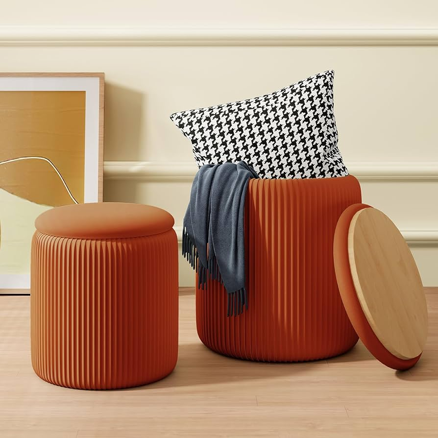
I do not need another safe beige cube.
As a retail buyer, I need a piece that wakes up the floor, photographs well online, feels current in-store, and still stays commercially manageable. That is exactly why the burnt orange velvet ottoman deserves more attention than it usually gets. It is not just a colorful accent. Done right, it becomes a low-footprint, high-impact SKU that gives a store warmth, tactility, and merchandising energy without asking the customer to redo the whole room. That matters more now because North American market signals are moving in the same direction: warmer palettes, comfort-driven storytelling, richer texture, and softer silhouettes are showing up again and again across the 2026 cycle. At Las Vegas Market, showrooms leaned into warmer color palettes, nostalgia, and comfort-core themes, while Apartment Therapy’s 2026 design coverage pointed to warming palettes tied to the natural world.
For buyers, that shift is not abstract trend talk. It changes what gets approved.
Home Accents Today’s summary of Apartment Therapy’s 2026 design forecast is especially useful because it sounds less like decoration and more like buying logic. The forecast says homes are moving toward warm, rich neutrals, including tones such as Warm Mahogany and Marigold. It also reports that 69% of designers favored curvy furniture silhouettes over clean-lined ones, 79% preferred brass over chrome, and homeowners’ biggest goals for 2026 were making spaces cozy, modern, and functional. That combination is exactly why a burnt orange velvet ottoman makes sense now: it sits at the intersection of warmth, softness, curve appeal, and function-led styling.
There is also a deeper design reason this works. Research from Cornell University and collaborators found that a visually warm store atmosphere can influence shoppers’ perceptions and approach behaviors, and that color and material texture both help create that sense of warmth. In the paper, the authors note that adding texture to furniture and interior surfaces can enhance warm atmosphere, and their findings showed that visually warm environments can increase intimacy perception and affect how people move toward a retail setting. In buyer language, that means warm color plus tactile upholstery is not a styling trick. It can shape how a product feels before it is even touched.
That is where a selection agent becomes more useful than a mood board.
A buyer does not really ask, “Is this pretty?” A buyer asks, “Will this help my floor, my margin story, and my risk control at the same time?” Teruier’s selection logic starts there. Instead of chasing trend in isolation, the selection agent filters a product through five questions: Is the market moving toward this signal? Does the silhouette feel current? Does the material deliver emotional value? Can function strengthen sell-through? Can the item sit naturally inside a broader assortment? With the burnt orange velvet ottoman, the answer is unusually strong because the color direction, the texture direction, and the multifunctional furniture direction are already converging in North America. Grand View Research says North America accounted for around 29% of the multifunctional furniture market in 2023, with demand supported by smaller living spaces and the need for versatile furniture.
Public retail data reinforces the point.
On Target’s orange ottoman pages, buyers can already see the category logic in plain sight: Tufted Round Storage Ottoman Velvet – HomePop carries a 4.4 rating from 23 reviews and includes a Spice Velvet colorway; Round Storage Ottoman – HomePop carries a 4.4 rating from 47 reviews; and Sunshine Storage Cube Ottoman – Orange – HomePop shows a 4.7 rating from 20 reviews. The lesson is not that these items are identical to Teruier’s proposal. The lesson is that the market is already validating the building blocks: warm color, velvet or soft-touch upholstery, compact footprint, and optional storage.
Walmart shows the same pattern from another angle. The Better Homes & Gardens Juliet Velvet Waterfall Ottoman shows 4.8 stars from 368 reviews, the Springwood Round Storage Ottoman, Beige Velvet shows 4.7 stars from 156 reviews, and the Lillian Velvet Tufted Ottoman shows 4.7 stars from 198 reviews while offering a Rust color option alongside neutrals. Again, these are not one-to-one duplicates of a burnt orange hero SKU. But they are strong public evidence that the category’s core ingredients already work in mass retail: velvet texture works, round forms work, storage works, and warm accent colors can sit inside a broadly commercial assortment.
This is why the burnt orange velvet ottoman is smarter than it first appears. It is not replacing the neutral program. It is upgrading it.
A safe neutral ottoman may fill space, but it rarely changes the emotional temperature of a presentation. A burnt orange version can. It lifts beige, camel, warm wood, brass-tone frames, chocolate brown, cream bouclé, and soft olive without overwhelming them. It gives a merchant team a more editorial lead item, yet it remains easier to test than a bold sofa, a patterned accent chair, or a larger casegood in a trend-sensitive finish. That is exactly the kind of product chain buyers want when they need distinction without drama. And for retailers already working with a US shoe storage ottoman supplier or a broader bench-and-storage program, this SKU is not a category detour. It is a style-forward extension of the same functionality conversation.
A Representative Buyer Scenario: How Teruier Would Turn a Color Risk Into a Better Retail Program
To make this practical, let’s look at an illustrative buyer scenario.
A mid-sized North American home décor chain is preparing a seasonal accent furniture update across 38 stores. The current ottoman assortment is safe but visually tired: beige, greige, cream, and standard performance textures. Sell-through is acceptable, but the floor lacks energy, digital merchandising looks repetitive, and the buyer team has no hero item that can carry a richer seasonal story.
Teruier’s selection agent does not begin by saying, “Let’s do orange.”
It begins by reducing uncertainty.
The first step is signal mapping. Warm, rich neutrals and marigold-adjacent tones are rising. Curvy forms are outperforming rigid lines in current design preference. Buyers and consumers alike are still prioritizing function and value. Public retail data shows that velvet ottomans, round storage ottomans, and warm-toned occasional pieces already earn reviews and repeat placement in large-format retail. So the recommended move is not a random fashion gamble. It is a structured three-piece test architecture:
- one hero burnt orange velvet ottoman
- one fluted velvet ottoman for stronger texture and shelf identity
- one round storage ottoman version for function-led selling
The second step is value translation. This is where Teruier’s cross-border design-manufacturing collaboration model matters. The buyer may be reacting to a market feeling: warmer, softer, more emotional. But the factory still needs specifics. Teruier translates that feeling into the real commercial decisions that make or break the SKU: orange tone calibration, velvet hand-feel, seat height, diameter, base finish, storage depth, carton efficiency, and whether the silhouette reads modern enough for chain retail without becoming too fashion-fragile.
In this representative planning model, success is measured with decision and rollout KPIs before chainwide volume is discussed. The broad concept shortlist is reduced from 11 accent-seat options to 3 testable SKUs. The sampling path is narrowed from a typical 3-round correction cycle to a 2-round development path because the aesthetic direction is aligned earlier. The merchandising story also improves: instead of presenting “another ottoman,” the buyer now has a coherent mini-family that can live in living room, bedroom, and entryway storytelling.
That is an important distinction. Buyers do not test color alone. They test a retail story.
And this is exactly where Teruier helps. Teruier is not simply supplying a stool. Teruier is helping the buyer run better retail assortment planning. The work is not just sourcing. It is selection filtering, story building, sampling efficiency, and commercial translation. In global sourcing home decor, that is often the real value gap. Too many vendors can quote a shape. Far fewer can explain why that shape, in that finish, in that color, at that price architecture, belongs in this season’s floor set.
The reason this illustrative case feels believable is simple: the market has already validated the ingredients. North American design direction is warming up. Curves have staying power. Velvet and other rich upholstery surfaces continue to signal softness and comfort. Multifunctionality remains commercially relevant. And mass retail platforms are already showing that storage ottomans and velvet ottomans have durable consumer acceptance. Teruier’s role is to read those signals earlier, narrow them faster, and convert them into a cleaner buy.
That is why the burnt orange velvet ottoman matters.
It gives buyers a better answer to a familiar problem: how to make a floor feel fresh without making the buy feel reckless. It is expressive, but not difficult. It is emotional, but still functional. It is trend-aware, but not trend-trapped. And in a market where buyers are under pressure to show stronger product judgment with tighter risk control, that combination is exactly what a winning accent piece should look like.
A beige ottoman may be easy to approve.
A burnt orange velvet ottoman is easier to remember.
And in modern retail, remembered usually beats merely safe.