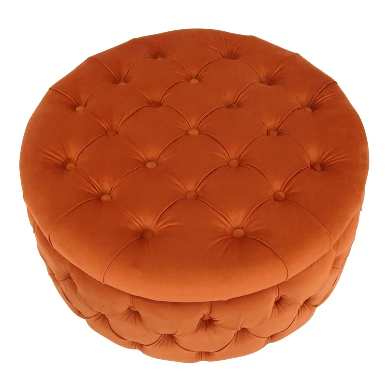
There was a time when many buyers treated orange upholstery with caution. Too bold. Too seasonal. Too difficult to scale. But the market has moved, and the room has changed with it. Today, a well-developed burnt orange velvet ottoman is no longer a risky accent. It is a calculated retail tool.
From a Middle East home-retail perspective, this matters. Our market does not respond only to function. It responds to atmosphere, material richness, and color that carries warmth without becoming noisy. That is exactly where burnt orange performs well. It gives depth, heat, and personality, but in the softened, more grounded way that velvet allows. It is not neon energy. It is mature warmth.
This direction is very much aligned with the latest regional design conversation. INDEX says its 2026 themes are being shaped by cultural authenticity, wellbeing, storytelling, innovation, and future-ready design, while its advisory-board guidance says “quiet luxury” in the region is increasingly defined by craftsmanship, tactility, timeless aesthetics, and emotional depth rather than material excess. Downtown Design Riyadh likewise frames the regional design scene around contemporary quality, creativity, and a design language shaped by tradition, craftsmanship, and innovation.
That is exactly why the burnt orange velvet ottoman makes sense now. It fits the regional move toward emotional, tactile, high-quality interiors. It can sit inside a modern apartment, a family majlis-inspired living setting, a hospitality-led home story, or a boutique retail vignette without looking out of place. It has enough presence to create a focal point, but enough softness to remain commercially usable.
There is also a stronger design logic behind the color than many suppliers admit. Research on interior environments has found that warm-colored settings can support better restorative responses than cold-colored or white ones. A 2020 Building and Environment study reported that inpatients experienced better restoration in warm-colored rooms, and a 2025 study on stress recovery in VR tested orange among the interior wall colors used to assess restorative effects. These are not furniture studies, but they support a broader point relevant to home retail: warm tones are not only decorative signals; they can shape how people feel in a space.
Velvet adds a second layer of commercial strength. In touch-dependent categories like upholstered furniture, buyers and end customers often decide before physical contact happens. A 2026 study on e-commerce purchase intention found that visual–tactile cues such as fabric folds, surface textures, and gloss can evoke tactile associations and support buying decisions when direct touch is unavailable. For a burnt orange velvet ottoman, this is highly relevant. The color attracts attention, but the velvet surface closes the sale by making the product feel touchable even in a still image.
This is why the user profile is clearer than many factories assume. The target buyer is not only the high-design shopper looking for one dramatic accent. It is also the chain-store customer who wants the room to feel warmer, more layered, and more personal without becoming difficult to style. Regional fair language around emotional connection, cultural identity, and wellbeing fits this customer very closely. In other words, the category is not succeeding because it is loud. It is succeeding because it feels emotionally usable.
From an assortment-planning perspective, the smartest version of this SKU is rarely a one-off. A burnt orange velvet ottoman works best inside a wider soft-furniture family. It can be positioned as a more expressive sibling to a boucle storage ottoman, a richer surface alternative to a clean cocktail ottoman, or a more glamorous companion to a compact swivel ottoman. In a slightly more decorative collection, it can also sit naturally beside a fluted velvet ottoman, where the color carries the warmth and the vertical texture carries the refinement. This is how one accent becomes a system.
That system matters because buyers today do not only want a good sample. They want range logic. They want to see how one color story can stretch across formats, price points, and channels. They want to know whether the same design language can live in full-price chain retail, curated marketplace selling, and value-driven programs without losing identity. This is where product development becomes more than styling.
For that reason, sample-to-bulk alignment is not a technical side note. It is central. Burnt orange is one of those colors that can look luxurious in a sample and disappointing in volume if the dye lot, velvet pile direction, foam tension, and photography standard are not tightly controlled. A serious buyer will immediately ask: does the bulk product keep the same warmth as the showroom sample? Does the velvet read deep and elegant, or flat and red? Does the seat keep its form? Does the carton protect the fabric well enough for store-floor presentation? These are not factory questions only. These are margin questions.
This is also where Teruier’s cross-border design-manufacturing coordination becomes meaningful. The point is not merely to sell another ottoman in another color. The point is value translation: taking a color-and-material signal that is working in the Middle East now, then converting it into a retail-ready SKU with correct proportion, correct fabric hand, correct carton logic, and correct bulk consistency. That is how a visual idea becomes a reorderable business.
There is another reason this category deserves attention: cross-market portability. A strong burnt orange velvet ottoman can be developed for Gulf retail, but it can also show strong U.S. retail fit when the silhouette and price architecture are handled correctly. In the U.S., the same piece can move through warm-modern, transitional, and fall-seasonal merchandising stories. This matters because globally aware buyers increasingly compare products not only against local competitors, but against what can travel across channels and geographies. That is also why an Amazon sourcing strategy cannot be ignored. On marketplaces, color must photograph clearly, texture must communicate instantly, and specification consistency matters more than showroom storytelling. The SKU has to win both on image and on repeatability.
And this is where the category becomes more interesting than many people think. It is not simply a colorful ottoman. It is a compact test case for how modern furniture retail now works. One product has to answer mood, materiality, digital presentation, cross-channel logic, and sourcing discipline all at once. The burnt orange velvet ottoman can do that when developed properly.
I would therefore not classify it as a seasonal risk item. I would classify it as a controlled statement SKU. It has enough energy to pull attention, enough tactility to hold interest, and enough flexibility to live across several assortment stories. In a market increasingly shaped by emotional depth, craftsmanship, and tactile value, that is not a niche opportunity. It is a very practical one.
So why is burnt orange no longer a risky color in furniture?
Because in the right material, the color stops feeling aggressive and starts feeling intentional.
Because in the right format, the ottoman stops being a decorative extra and becomes a retail driver.
And because for today’s buyer, warmth that sells is often more valuable than neutrality that disappears.
That is why the burnt orange velvet ottoman deserves serious consideration.
Not as a trend experiment.
As a smart, retail-ready accent with real commercial life.