Let’s clear something up before the keyword gets abused by another catalog full of beige excuses:
A wabi sabi ceramic vase is not just an uneven vase in a muted color pretending to be profound.
That is lazy product design wearing philosophy as a scarf.
A good wabi sabi ceramic vase is much harder than that. It has restraint, yes—but also proportion, surface intelligence, tactile credibility, and enough emotional weight to make a buyer think, “This will actually calm a shelf down without putting it to sleep.”
That is why this category matters.
Not because it is trendy in the obvious sense.
Because it solves a very modern retail problem: how do you give customers something quiet that still feels specific?
Why this makes sense now
The current North American market is rewarding products with stronger emotional texture, not just louder color. NY NOW’s Winter 2026 preview highlighted products that create emotional bonds through sensory engagement, while Las Vegas Market Winter 2026 positioned itself as a major sourcing platform with 3,500+ product lines and strong new-buyer momentum. That is exactly the environment where a well-developed wabi sabi ceramic vase works: tactile, collected, calming, and visibly intentional rather than mass-bland.
That matters for chain buyers because customers are still buying “minimal” pieces—but not the dead, generic kind. They want warmth, materiality, imperfection with control, and objects that feel hand-considered rather than factory-flattened.
So yes, the category is subtle.
No, it should not be weak.
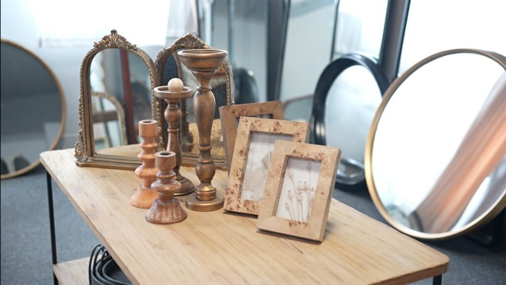
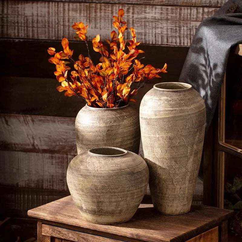
What this product actually is
A retail-ready wabi sabi ceramic vase is a decorative ceramic vessel built around:
- asymmetry or softened geometry
- tactile surface character
- calm but layered glaze treatment
- earthy, mineral, chalky, sand, ash, stone, or warm off-white tonal direction
- enough sculptural presence to work with or without florals
That last point matters more than people think.
A good wabi sabi vase should still look complete when empty.
If it only works with branches stuffed into it like life support, the form is not doing its job.
This is why the category works well across:
- chain home décor retail
- contemporary tabletop accents
- shelf styling
- entryway and console vignettes
- wellness-leaning interiors
- hospitality and residential decorative edits
- home decor wholesale for retailers
- curated, design-led seasonal assortments that do not want to scream “seasonal”
What old versions got wrong
The old failure pattern is painfully familiar:
- too brown
- too flat
- too “handmade” in the wrong, messy way
- weak silhouette
- inconsistent glaze from unit to unit
- carton breakage on the neck or rim
- romantic story, ugly production reality
And that is the trap. A buyer does not need vague “artisanal energy.” A buyer needs a vase that can survive line review, survive shipment, survive shelf placement, and survive reorder comparisons.
That means this category lives or dies on discipline:
- shape control
- surface control
- tone control
- pack-out control
- reorder control
Which is not very mystical, but it is very profitable.
The specs buyers should actually care about
If I am buying a wabi sabi ceramic vase, I want a supplier to speak in retail language, not mood-board fog.
A serious spec conversation should include:
Material
Ceramic or stoneware body, stable base, wall-thickness logic appropriate for size, and enough body weight to feel substantial without becoming freight-stupid.
Surface character
Matte, satin, sandy, dry-touch, hand-brushed, or lightly reactive finishes all work—but they need intention. Texture should feel controlled, not accidental.
Glaze logic
This is where glaze consistency QC matters. A wabi sabi finish can absolutely tolerate tonal variation. In fact, that is often the point. But “variation” and “production inconsistency” are not the same thing. A buyer should know the acceptable range of tone shift, surface pooling, speckling, and edge darkening before mass production starts.
Shape architecture
Good programs typically work with at least two or three proportions:
- short rounded form
- medium bottle or shoulder vase
- taller statement silhouette
That gives the buyer enough assortment flexibility without turning the line into a ceramic family reunion no one asked for.
Transit logic
Tall necks, narrow rims, and handmade-style edges are fragile in very specific ways. That is why ceramic packaging to reduce breakage is a commercial issue, not a warehouse issue. Michigan State describes packaging as a formal discipline, and academic research on e-commerce packaging continues to highlight real design and logistics challenges, including overpackaging and inefficient format decisions.
So if a supplier cannot explain how the neck, shoulder, and rim are protected in transit, they are not selling you a vase program. They are selling you future apologetic emails.
MOQ, eco packaging, and why buyers care more than ever
This is where the conversation gets real.
A lot of ceramic suppliers love to talk about aesthetics and become mysteriously quiet the moment minimum order quantity enters the room.
But buyers care deeply about it.
Because the right MOQ is not just a factory number. It affects:
- assortment breadth
- testability
- inventory risk
- speed to reorder
- margin by store cluster
- online versus store-channel allocation
A thoughtful bulk home decor supplier should be able to help buyers decide when a wabi sabi ceramic vase should launch as:
- one hero SKU
- a 2-piece shape family
- a 3-SKU tonal story
- or a broader décor collection
The same goes for eco packaging. Buyers do not want wasteful pack-out theatre just to make a supplier feel protective. They want packaging that protects the product, respects freight math, and does not create silly cube inefficiency. Protection and restraint should coexist. The product is called wabi sabi, after all. It would be a bit embarrassing if the carton looked like it was prepared for re-entry from space.
An illustrative Teruier selection-intelligence case
Here is the kind of chain-retail brief this category is built for.
A U.S. home décor buyer wants a calm, earthy ceramic story that works across both store shelves and online photography. The goal is to reach customers who want their homes to feel thoughtful, not cluttered; warm, not sterile.
The old sourcing approach would be:
“Find a matte beige vase, call it wabi sabi, hope no one notices.”
The smarter Teruier-style approach is:
- define whether the product is décor-first or floral-functional
- choose which size becomes the volume hero
- set acceptable glaze variation before sampling
- test texture against real retail lighting and photography
- plan minimum order quantity by channel, not just by factory convenience
- use eco packaging logic that still protects vulnerable neck and rim areas
- decide whether the line is better as a quiet standalone program or as part of a broader neutral décor story
Illustrative outcome model:
A stronger product brief usually improves sample approval, reduces buyer hesitation, and produces a more coherent line because the product is being judged against real merchandising conditions rather than abstract styling language. The commercial upside is not drama. It is reliability.
And reliability, for a chain buyer, is often the most attractive aesthetic of all.
Who this product is for
This is not for the buyer who wants loud novelty and instant impulse gimmicks.
This is for:
- chain home décor buyers
- design-led gift and décor merchants
- retailers building calmer, tactile shelves
- hospitality-inspired décor programs
- retailers buying home decor wholesale for retailers that needs broader channel flexibility
- merchants who want quiet product with strong photography value
That user profile maps well to the current North American shift toward more sensory, more emotionally grounded product—but with very high standards around packaging, QC, and reorder stability.
Final word
A wabi sabi ceramic vase should not feel like an apology for being plain.
It should feel deliberate.
Textural.
Grounded.
Useful.
And commercially disciplined enough to justify repeat orders.
That is the difference between a trend label and a real retail product.
The wrong supplier sells you the word “wabi sabi.”
The right supplier sells you the silhouette, the glaze range, the MOQ logic, the pack-out strategy, and the reason the customer will keep living with it six months later.
That is what Teruier is really helping buyers evaluate.
Not whether the vase is quiet.
Whether the quiet has structure.