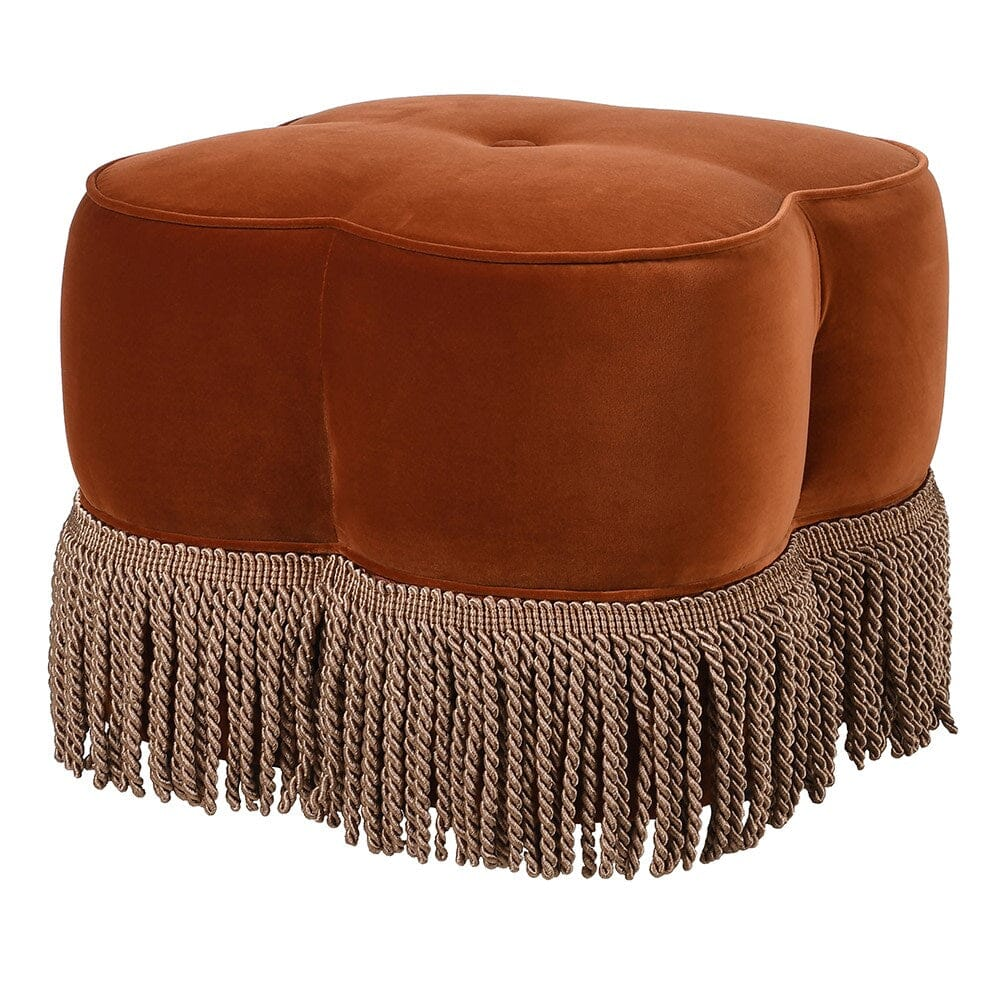
The Burnt Orange Velvet Ottoman Is Not Too Bold — Your Floor Might Just Be Too Safe
Every season, someone tries to convince buyers that another beige ottoman is the answer.
Another oatmeal cube.
Another “versatile neutral.”
Another perfectly nice object with all the charisma of a tax form.
Respectfully, no.
If I’m buying for a Canadian home retailer, I do not need another piece that disappears politely into the floor and calls it restraint. I need product with warmth, shape, and enough personality to make a customer stop — without making my inventory plan start sweating.
That is where the burnt orange velvet ottoman earns its place.
Not because it is loud.
Not because it is trendy in the flimsy, one-season way.
But because it does something many “safe” products fail to do: it gives the room a pulse.
And right now, North American market signals are moving in exactly that direction. Las Vegas Market’s Winter 2026 coverage leaned into buyer-driven innovation, visual storytelling, and mood-led groupings such as Timeless Romance, Symbols & Shapes, and Restorative Softness. High Point Market’s 2026 trend programming has also pointed toward expressive, personality-driven interiors, elevated craftsmanship, and richer textures. That is a polite industry way of saying the market is tired of flat, overmatched rooms that look as though they were assembled by committee.
Why this colour works now
A burnt orange velvet ottoman lands in a very useful sweet spot.
It is warmer than rust’s moodier cousin.
It is richer than tan.
It has more appetite than plain terracotta.
And in velvet, it picks up light in a way that makes the floor feel more layered, more tactile, and frankly more alive.
For a Canadian buyer, that matters. We merchandise through long winters, dull light, and long selling windows where a product has to feel emotionally useful, not merely acceptable. Burnt orange does that beautifully. It brings heat without chaos. It adds colour without forcing the whole room into maximalist theatre. It works with walnut, oak, blackened metal, cream upholstery, warm white walls, deep blue accents, and the increasingly popular mixed-texture room stories that North American design media and market programming keep circling back to.
In other words, it is not a gimmick.
It is a merchandising tool.
The ottoman has had a promotion
The ottoman is no longer just a footrest, and thank goodness for that, because furniture that only performs one job is becoming a hard sell unless it is truly extraordinary.
Reputable design coverage for 2026 has highlighted the rise of layered ottomans and more than one ottoman in a room, precisely because they offer flexibility, comfort, visual rhythm, and a more lived-in feel. That matters for retail because it shifts the ottoman from “extra piece” to “active design unit.” It becomes seating, soft geometry, a casual table, an anchor for the conversation zone, or simply the thing that stops the room from looking too stiff.
That is why a burnt orange velvet ottoman is especially interesting now.
It carries colour.
It carries texture.
It carries shape.
And it can carry the room.
A fluted velvet ottoman version adds more vertical rhythm and a slightly dressier edge. A cleaner silhouette can skew more modern. A softer oversized profile can work as a small cocktail ottoman stand-in. A version with hidden function edges toward the practical territory buyers expect from a good storage ottoman supplier. The point is not to flood the assortment with variants. The point is to give the buyer a smart family of options with clear roles.
That is where most suppliers lose the plot.
They show you six similar pieces and call it breadth.
A better supplier shows you three and calls it discipline.
Trend-based curation beats random product dumping
This is the part buyers usually understand in their bones, even if suppliers keep pretending otherwise: products do not sell in isolation. They sell inside a visual atmosphere.
Academic research has been clear that visual merchandising and store atmosphere are tightly connected. Translation: the products you choose do not just fill space; they shape how the entire store feels. That is why a good assortment is not a pile of individually acceptable items. It is a controlled emotional environment.
That is exactly why trend-based curation matters.
A burnt orange velvet ottoman gets much stronger when it is not left to fend for itself like some brave little jewel-toned orphan in a sea of beige upholstery. It wants company. It wants contrast. It wants a supporting cast that makes it look intentional instead of impulsive.
That supporting cast might be:
a boucle swivel chair to add tactile contrast and soft volume;
a tailored bed end bench in a quieter neutral to stretch the story into the bedroom;
a smaller fluted velvet ottoman to echo the hero SKU without cloning it;
or a functional variation from a trusted storage ottoman supplier for customers who want beauty with a side of hidden practicality.
That is not overdesign.
That is retail intelligence.
How Teruier helps a buyer make this actually work
This is where Teruier becomes useful, and not in the vague “global sourcing partner” sort of way that usually means nothing.
Teruier’s cross-border design-manufacturing collaboration model works because it connects what buyers actually need: market reading, product translation, and execution discipline. In other words, it bridges the awkward gap between “this feels right for the moment” and “can this survive line review, floor placement, first shipment, and reorder?”
That bridge is where most programmes fail.
Teruier’s selection agent does not start by asking, “Which ottoman do you like?”
It starts with the better question:
What role does this ottoman need to play in the assortment?
If the answer is “wake up the floor,” then the hero piece may be a burnt orange velvet ottoman with enough shape and visual weight to anchor a living-room story.
If the answer is “add a stronger silhouette,” then a fluted velvet ottoman becomes the cleaner move.
If the answer is “extend the warmth into the bedroom,” then a bed end bench enters the mix.
If the answer is “give the room movement and softness,” then a boucle swivel chair is the obvious counterpoint.
And if the answer is “make the customer feel clever for buying it,” then a function-led piece from a strong storage ottoman supplier can quietly widen the programme.
That is value translation.
The buyer says, “The floor feels a bit stale.”
Teruier translates that into a working set of SKUs, textures, roles, and risk levels.
What a winning programme looks like in numbers
This is the part buyers care about, because eventually every lovely mood board has to answer to a spreadsheet.
A strong Teruier-style ottoman programme is not built around adjectives. It is built around a scorecard.
The scorecard usually looks something like this:
sample approval narrowed toward the 18–21 day range because the assortment direction is clear;
hero SKU sell-through target above 65% in the first 8 weeks, rather than floating through the season as a “nice accent” that nobody fully committed to;
companion pieces such as a bed end bench or fluted velvet ottoman set with slightly lower but still disciplined early-turn targets, often in the 50–55% range;
first-shipment issue rate pushed toward sub-2% because the supplier treated construction, fabric handling, and packaging as real parts of the programme, not afterthoughts;
and reorder discussion opened by week 8–10, because the line was designed to prove itself quickly.
Those are not vanity metrics.
They are the difference between a colour story and a commercial story.
Why the first five reviews matter more than the first fifty compliments
Here is where many buyers quietly become data romantics, and fair enough.
We all love a beautiful product. But beauty does not reorder itself.
Northwestern’s Medill Spiegel Research Center found that a product with five reviews has a purchase likelihood 270% higher than a product with none. Reviews matter even more for higher-priced items, where displayed reviews increased conversion by 380% versus 190% for lower-priced products. Verified-buyer badges also improve odds of purchase by 15%. For a considered piece like a burnt orange velvet ottoman, that is not a side note. That is the start of momentum.
That is why Teruier’s selection logic is not just about which product looks exciting.
It is about which product can survive the whole chain of events:
good first impression
good photography
good arrival condition
good customer reaction
good early reviews
good internal confidence
good reorder odds
That, in retail terms, is what success looks like wearing velvet.
Why this piece speaks to Canadian buyers in particular
Because Canadian buyers often do not have the luxury of buying throwaway drama.
We need product that can live through longer transitions, mixed weather moods, and customers who want warmth without kitsch, character without clutter, and texture without nonsense.
A burnt orange velvet ottoman does that surprisingly well.
It makes neutral rooms feel less sleepy.
It gives contemporary schemes a softer centre.
It plays beautifully with a boucle swivel chair.
It can move into a bedroom beside a bed end bench.
It can become part of a smarter family with a fluted velvet ottoman or a more practical offering from a storage ottoman supplier.
Most importantly, it feels human.
And right now, “human” is a stronger selling point than “perfectly matched.”
Final thought
The burnt orange velvet ottoman is not too much.
It is just enough.
Enough colour to wake up the floor.
Enough texture to justify attention.
Enough versatility to move across room stories.
Enough charm to make the customer remember it.
And if your supplier still thinks the answer is another safe neutral cube with the personality of office carpeting, perhaps it is time for new company.
That is the real value of Teruier.
Not simply offering product.
Not simply following trends.
But helping buyers turn trend signals into assortments that feel warmer, sharper, and a lot more sellable.