Product Introduction
Why buyers pick this style (and why it sells on the floor)
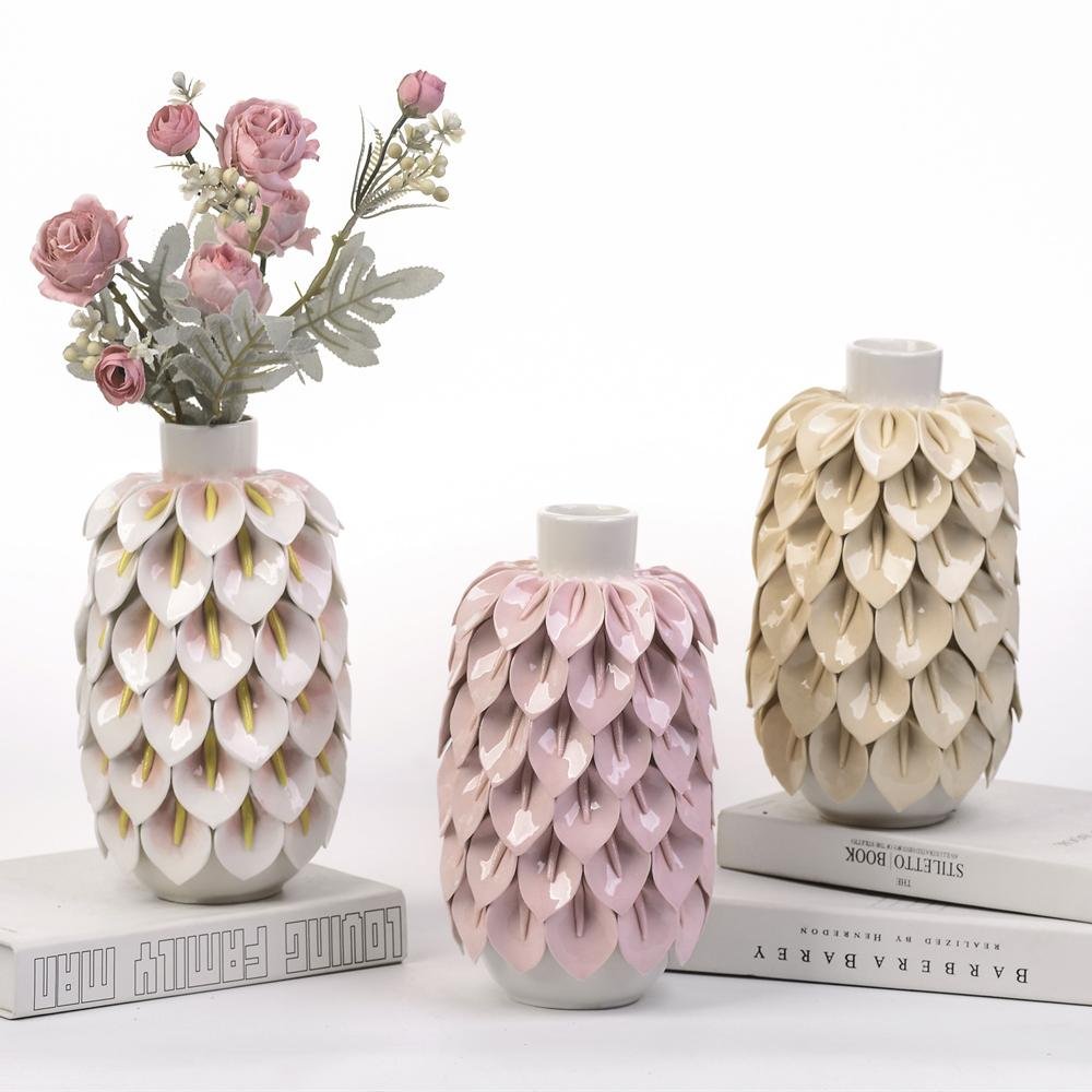
When you’re building an assortment, you’re not just buying a “pretty vase”—you’re buying display impact per square foot, giftability, and repeatable sell-through. This Petal-Scale Ceramic Vase Collection is designed for exactly that: a high-texture silhouette that reads “new” from a distance, paired with soft pastel colorways that blend into multiple décor stories (spring refresh, romantic neutrals, modern cottage, feminine minimal, boutique gift).
There’s also a proven reason natural/floral forms keep winning in home décor: research on biophilic/nature-inspired design shows these cues can support comfort and wellbeing in indoor environments—one reason shoppers consistently respond to botanicals and organic shapes. And studies have linked receiving flowers with measurable positive emotional response—helpful context for why “floral” categories remain strong for gifting and self-purchase.
Teruier in one sentence
Teruier is a reorder-ready craft-hub supplier that turns trend-forward ceramic forms into retail-safe, margin-friendly assortments—without the “sample looked great, shipment looked different” problem.
What makes this collection “retail practical,” not just “design nice”
1) Set logic that merchandises itself
Three coordinating silhouettes (short/medium/tall feel) let you build an instant story: good / better / best price laddering, or “buy one / buy the set” bundling.
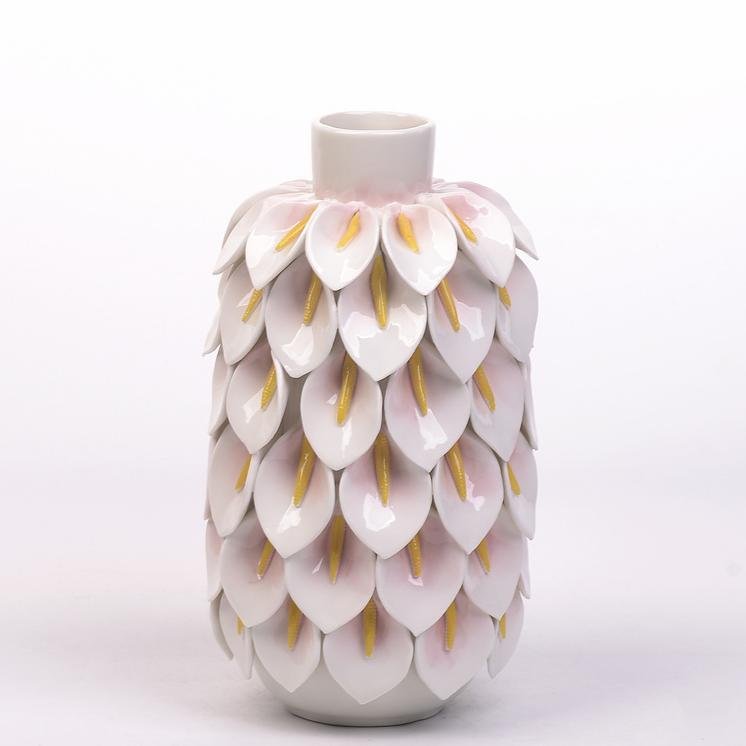
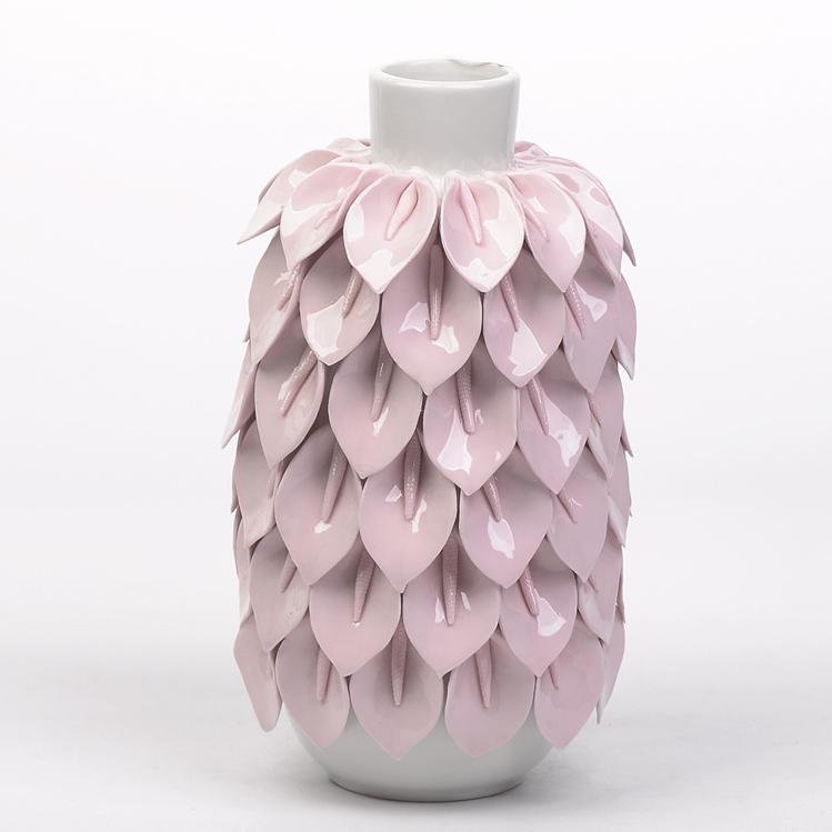
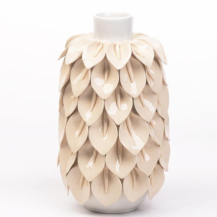
2) Texture that reads online and in-store
The layered petal surface creates shadow + depth, so it photographs well for e-comm thumbnails and still pops on a shelf from six feet away—this matters for conversion and walk-by pickup.
3) Colorways that reduce risk
Soft blush and warm ivory tones are easy to cross-merch with candles, books, trays, and faux florals—meaning fewer “hard-to-style” returns and better attachment sales.
4) Giftable, collectible, repeatable
This is the kind of piece customers buy once… then come back for another color or size. That’s what buyers want: not one-time novelty, but repeat behavior.
Buyer persona
If your job title includes Category Manager, Home Décor Buyer, Off-Price Buyer, or Visual Merchandising lead, your daily pain points are usually:
“Will it look premium at my price point?”
“Will it break in transit and kill margin with returns?”
“Can the vendor repeat quality when I reorder?”
“Can I build a full display story fast?”
This collection is built to answer those questions: it’s display-friendly, set-friendly, and program-friendly—especially for buyers who need newness without betting the season on a risky silhouette.
Ideal Use Cases
Entryway styling: console table moment—pair with a catchall tray and a mirror for a “first impression” vignette.
Living room shelf & built-ins: adds high texture next to stacked books and framed art (great for neutral rooms that need depth).
Coffee table centerpiece: tall vase anchors a tray arrangement; short vase supports a candle + object grouping.
Dining table seasonal refresh: soft florals for spring brunch setups; switch stems for fall branches.
Bedroom dresser / nightstand décor: blush/ivory works with linen bedding palettes—easy upsell in bedding departments.
Bathroom spa vignette: small vase + eucalyptus stems on a vanity or shelf for “boutique hotel” styling.
Boutique gift section: perfect as a “grab-and-go” elevated gift—especially when bundled with faux stems or a candle.
Off-price and closeout formats: high perceived value from texture; reads “designer look” even in fast-turn environments.
Hospitality styling: lobby consoles, reception desks, model rooms—adds softness and a photogenic focal point.
Seasonal programs: Mother’s Day gifting, Spring Refresh, Valentine’s/romantic neutrals, “Soft Minimal” trend tables.
Online listing hero: the texture creates strong thumbnail differentiation—use one as hero, show the trio for upsell.
In-store display building: works as the “height piece” for tiered tables and endcap vignettes.
Merchandising tips
Bundle strategy: sell as singles + “Complete the set” signage to lift AOV.
Cross-merch: pair with faux stems, taper holders, coffee table books, or small sculptural objects.
Color story: group with creams, sand, pale pink, light oak, and warm metals for a cohesive trend table.
Quality & readiness notes
For retail programs, we recommend specifying these as your acceptance checkpoints:
glaze consistency (color drift control between batches)
petal alignment/adhesion (no loose edges)
rim and base flatness (stable on shelf)
inner cavity finish (no sharp glaze runs)
protective packaging fit (petal surface needs anti-scratch protection)
drop/transport simulation for sample approval before bulk
Close (CTA)
If you’re building a seasonal décor table or a giftable vase program, this collection is an easy “yes”: it’s trend-forward but not fragile in styling, premium-looking but still scalable. Tell us your target price tier and channel (off-price, specialty, mass, hospitality), and we’ll propose the best size/color assortment and a reorder plan.