Global Trend Insights Aren’t a Mood Board. They’re Inventory Insurance.
If you’ve ever sat across from a U.S. home décor buyer and watched us nod politely while you flip through “trend inspiration,” here’s what we’re really thinking:
Inspiration is cheap. Missed timing is expensive.
Because the truth is, I don’t buy trends—I buy timed bets. And the only reason I care about global trend insights is this: they reduce the odds that I’ll be stuck with the wrong texture, the wrong color, or the wrong story… right when my floor set is supposed to be peaking.
Let me show you what “global trend insights” looks like from my side of the desk—when a chair program needs to land on time, a color story needs to hold across reorders, and my open-to-buy isn’t interested in my “creative journey.”
The Biggest Misunderstanding: Trend ≠ Product
A trend is not “make it beige” or “add curves.” That’s Pinterest-level advice.
For me, global trend insights only become useful when they answer three operational questions:
Is this a global signal or a local fad?
Will it still sell when it hits my shelves—not when I saw it online?
Can I reorder it without the second shipment looking like a different product?
If you can’t connect trend → timing → repeatability, you’re not giving me insights. You’re giving me vibes.
Where My Global Trend Insights Actually Come From
Here’s the part many suppliers don’t realize: buyers don’t rely on one “trend report.” We triangulate.
1) Search behavior tells me what consumers are moving toward
When I want early signal, I look at platforms that publish demand clues at scale. Pinterest’s annual “Pinterest Predicts” is one of the more widely referenced sources because it’s built on search behavior and highlights what’s rising into the next year.
As a buyer, I don’t treat it like a shopping list. I treat it like a radar:
What aesthetics are gaining momentum?
What “language” will shoppers recognize by the time my product lands?
2) Color authority tells me what will become a common vocabulary
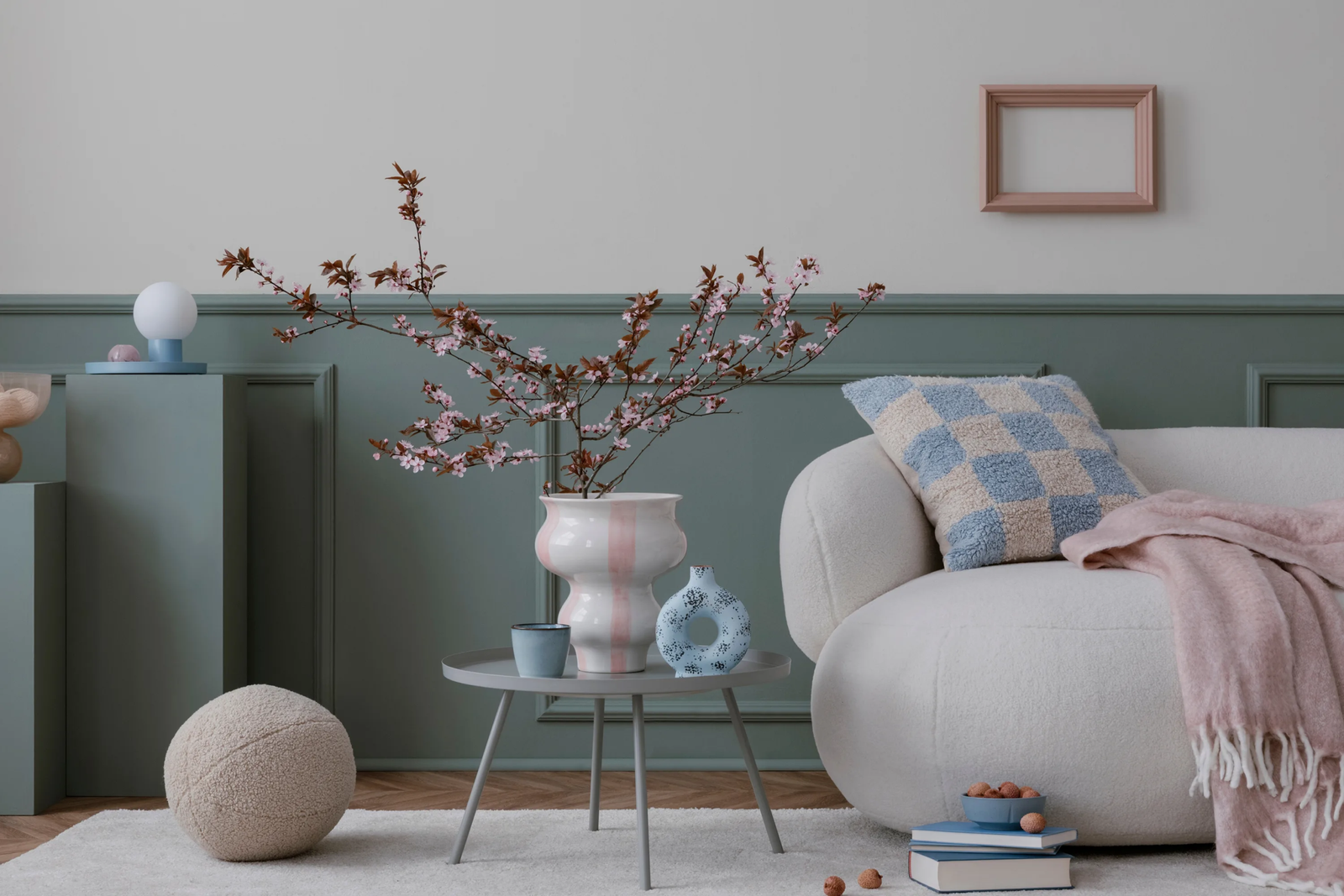
Pantone’s Color of the Year matters less as a “paint instruction” and more as a global shorthand. For 2026, Pantone selected Cloud Dancer (PANTONE 11-4201)—a soft, airy white positioned as a foundational, versatile tone.
In practical buyer terms: this nudges assortments toward quiet backdrops, layered neutrals, and materials that carry the interest (texture, grain, hand-feel) rather than loud color alone.
3) Trade fairs show me what brands can actually execute at scale
If you want global trend insights with teeth, you watch the fairs—because fairs reveal what’s manufacturable, not just what’s imaginable.
Maison&Objet’s official trend editorial has been leaning hard into themes of heritage, transformation, and reinterpreting the past—packaged into clear directional stories.
And coverage of the January 2026 edition shows how those themes translate into real-world installations and product directions—materials, cultural references, and bolder craft narratives you can actually merchandise.
4) Market weeks tell me what retailers will buy right now
High Point Market is where I pressure-test what’s “design talk” versus what’s “buying reality.” When major voices summarize what stood out, I pay attention—because those signals often mirror what ends up flowing through U.S. retail channels.
The Buyer Filter: Turning Global Trend Insights Into Reorder-Safe Assortments
This is where suppliers can win me over—fast. If you can talk through my filter with me, you move from “vendor” to “partner.”
Filter 1: The Three-Source Rule
A trend becomes actionable when I see it in at least three different “systems,” for example:
consumer search behavior (Pinterest-type signal)
a global color narrative (Pantone-type vocabulary)
trade fair direction (Maison&Objet-type execution)
One source is interesting. Three sources is a buy-plan.
Filter 2: The “Landing Date” Reality Check
If the trend peaks in January but my shipment arrives in May, I’m late.
So I translate trend timing into:
prototype window
PO decision deadline
production lead time
shipping buffer
floor set date
Global trend insights only help if they’re mapped to calendars.
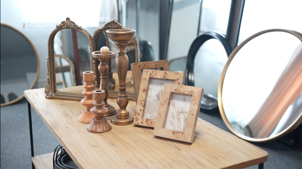
Filter 3: The “Touch Test” (Texture is the new color)
In 2026, shoppers don’t just look—they touch. That’s why neutrals can still feel new: the difference is tactile.
This aligns with the broader movement you see across trade fairs and trend editorial: materials and craft cues doing the storytelling work.
If your product story is texture-led, my next question is:
Can you keep that texture consistent across batches?
Filter 4: Risk Budget (a.k.a. Where I’ll Allow “Art”)
Every assortment has a risk budget. I’ll take some daring pieces—if the program has dependable anchors.
Pantone’s Cloud Dancer narrative reinforces this idea of “foundation tones” that let other elements shine.
So I structure assortments like:
Core: safe silhouettes, stable neutrals, proven materials
Edge: one bold craft detail, one new finish, one new proportion
Suppliers who understand this stop overselling “innovation” and start helping me balance it.
Filter 5: Reorder Proof
This is the one that decides whether you get year-round business.
For me, “reorder proof” means:
color standards that don’t drift
materials that can be sourced again
specs that hold (height, cushion crown, hardware finish)
packaging that protects the product the same way every time
lead times that don’t magically change after the first PO
What I Want From Suppliers Who Claim They Have Global Trend Insights
If you’re pitching me using the keyword global trend insights, here’s what makes me lean in:
Give me a “trend → SKU translation,” not a collage
Show me:
the trend direction (in one sentence)
what it becomes in product terms (shape, material, finish)
how it fits my merchandising (room story, price ladder, cross-sells)
Bring receipts from credible systems
Reference the real signals:
consumer search direction (Pinterest Predicts style evidence)
global color language (Pantone 2026)
trade fair direction (Maison&Objet)
market validation (High Point summaries)
Not because I need you to “name drop”—because it tells me you’re not guessing.
Offer modularity
If the silhouette is right, let me swap:
fabric / finish
colorway
trim detail
leg finish / hardware tone
That’s how buyers keep a program current without resetting the whole supply chain.
The Part Nobody Says Out Loud: Trend Insight Without Execution Creates Returns
A supplier can be trend-right and still fail me if:
the sample is perfect but bulk is inconsistent
the packaging can’t handle real transit
the second order looks like a cousin, not a twin
So yes—I want global trend insights. But what I’m really buying is operational translation:
“We saw the same global signals you saw. Here’s how we engineered them into a SKU you can reorder.”
That’s the difference between “trend-aware” and “retail-ready.”
Closing Thought (From One Over-Caffeinated Buyer)
The best global trend insights don’t make me feel inspired.
They make me feel safe.
Safe to place the PO.
Safe to set the floor.
Safe to reorder when it hits.
If you can deliver that—using credible global signals, clear product translation, and repeatable execution—you won’t just be on my vendor list.
You’ll be in my plan.