Product Introduction
Definition
The V2577–V2582 collection is a multi-SKU decorative ceramic vase program built around sculptural form, mineral green color, and tactile visual texture. Each piece uses a slightly different silhouette—some softer and folded, some faceted, some more organic or floral—so the collection feels cohesive without becoming repetitive.
This matters for a mall buyer because a good vase program is not only about one attractive item. It is about whether the collection can:
- build a complete display story
- create a color-and-shape rhythm on shelf or tabletop
- feel premium in a small footprint
- and offer enough SKU variety to support visual merchandising, gifting, and layered assortment planning
That is exactly what this collection is designed to do.
Why This Collection Works for Buyers
Decorative vases often fail in one of two ways.
They are so safe they become invisible.
Or they are so artistic they become hard to scale.
The V2577–V2582 collection sits in the more commercially useful middle.
The soft green metallic finish gives the buyer a color story without requiring bright-risk fashion buying.
The sculptural forms create enough stop-power to make the category feel elevated.
The multi-shape program helps buyers build a display rather than relying on one hero item.
The ceramic body and varied openings allow the pieces to work as both decorative objects and vase-led styling elements.
For buyers, that combination is important because it makes the assortment easier to approve, easier to merchandise, and easier to ladder across sizes and price points.
Why the Timing Is Right
Recent European design-fair direction has leaned strongly toward materials as experience, tactile storytelling, sensory retail, and collectible-feeling decorative objects. Maison&Objet’s 2026 editorial framing emphasized that materials should be experienced, not just seen, while the broader Past Reveals Future trend language highlighted mutation, hybrid forms, transformed objects, and materiality as a central emotional driver in décor and retail.
That is why this green ceramic collection makes sense now.
It is decorative, but not anonymous.
It is colorful, but not loud.
It is artistic, but still retail-legible.
In U.S. market language, current design direction also continues to reward sculptural statement design, tactile materials, and thoughtful textured palettes, which supports this type of tabletop object in modern home décor assortments.
Buyer Pain Points This Collection Solves
This collection solves several real-world category issues:
1. Plain vase assortments that look interchangeable
The silhouettes here are more memorable and shelf-distinctive.
2. Decorative objects with weak merchandising logic
Multiple related forms make grouping, price stepping, and display building much easier.
3. Color stories that feel too seasonal or too risky
The celadon-green metallic finish feels fresh and current, but still calm enough for broad placement.
4. Small décor with weak perceived value
The finish, shape, and textural surface help these pieces read as more designed and more giftable.
5. Buyers needing “art-object” feeling without gallery-only product difficulty
These vases feel expressive, but they are still easy to understand and easy to style.
Product Parameters
Collection: V2577–V2582
Category: Decorative ceramic vase collection
Material: Ceramic
Finish: Metallic celadon / mineral green with speckled surface detail
Style Direction: Sculptural, fluid, collectible, contemporary
Primary Use: Decorative vase, tabletop object, shelf accent, grouped console display
Individual Sizes
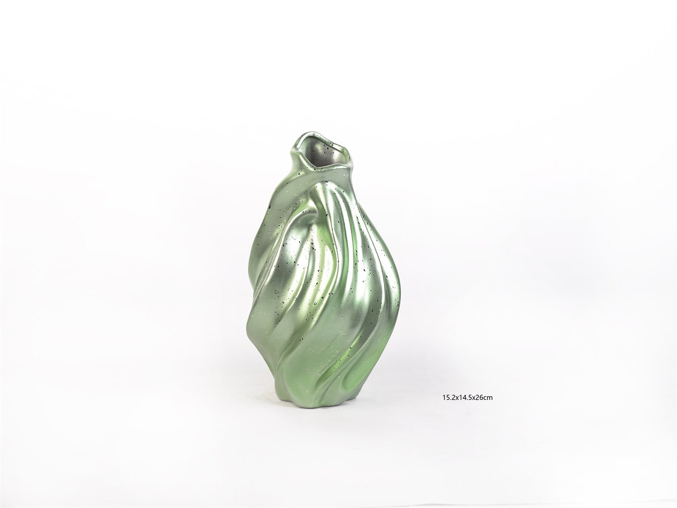
V2577: 15.2 × 14.5 × 26 cm
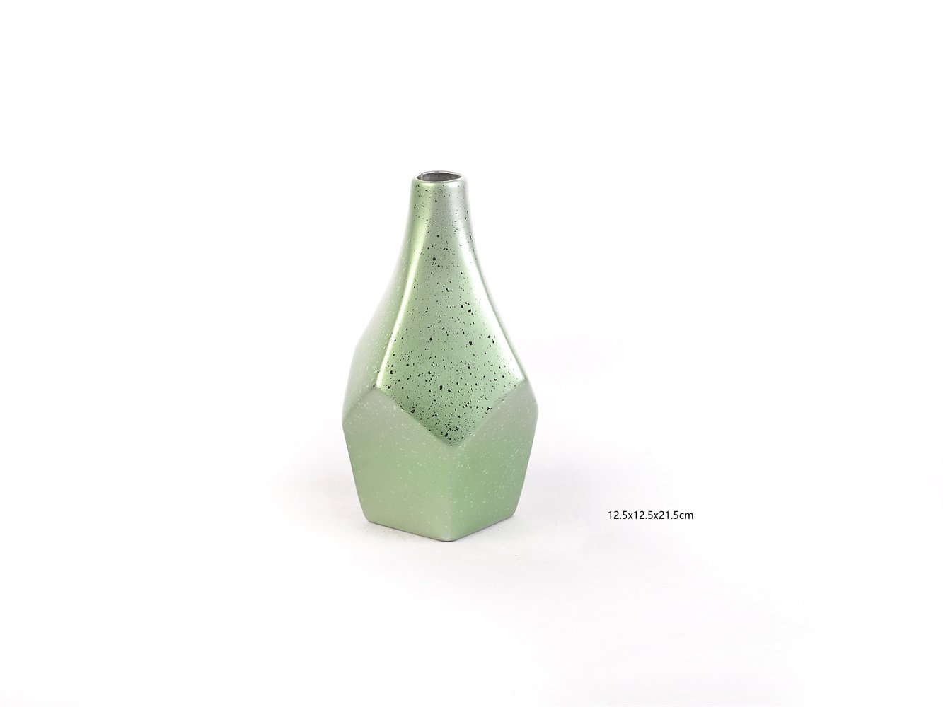
V2578: 12.5 × 12.5 × 21.5 cm
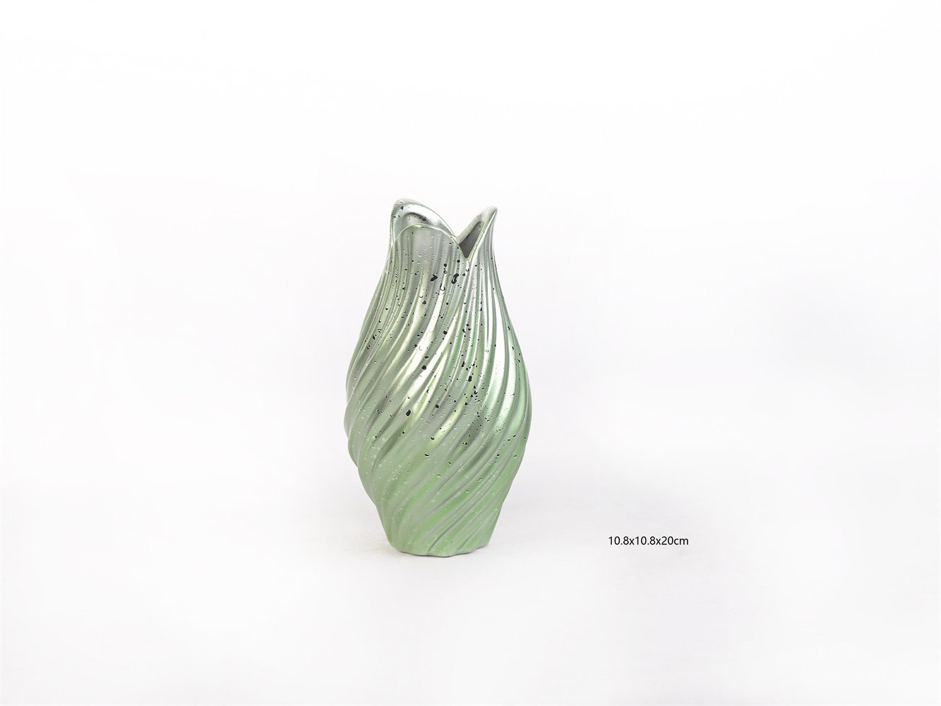
V2579: 10.8 × 10.8 × 20 cm
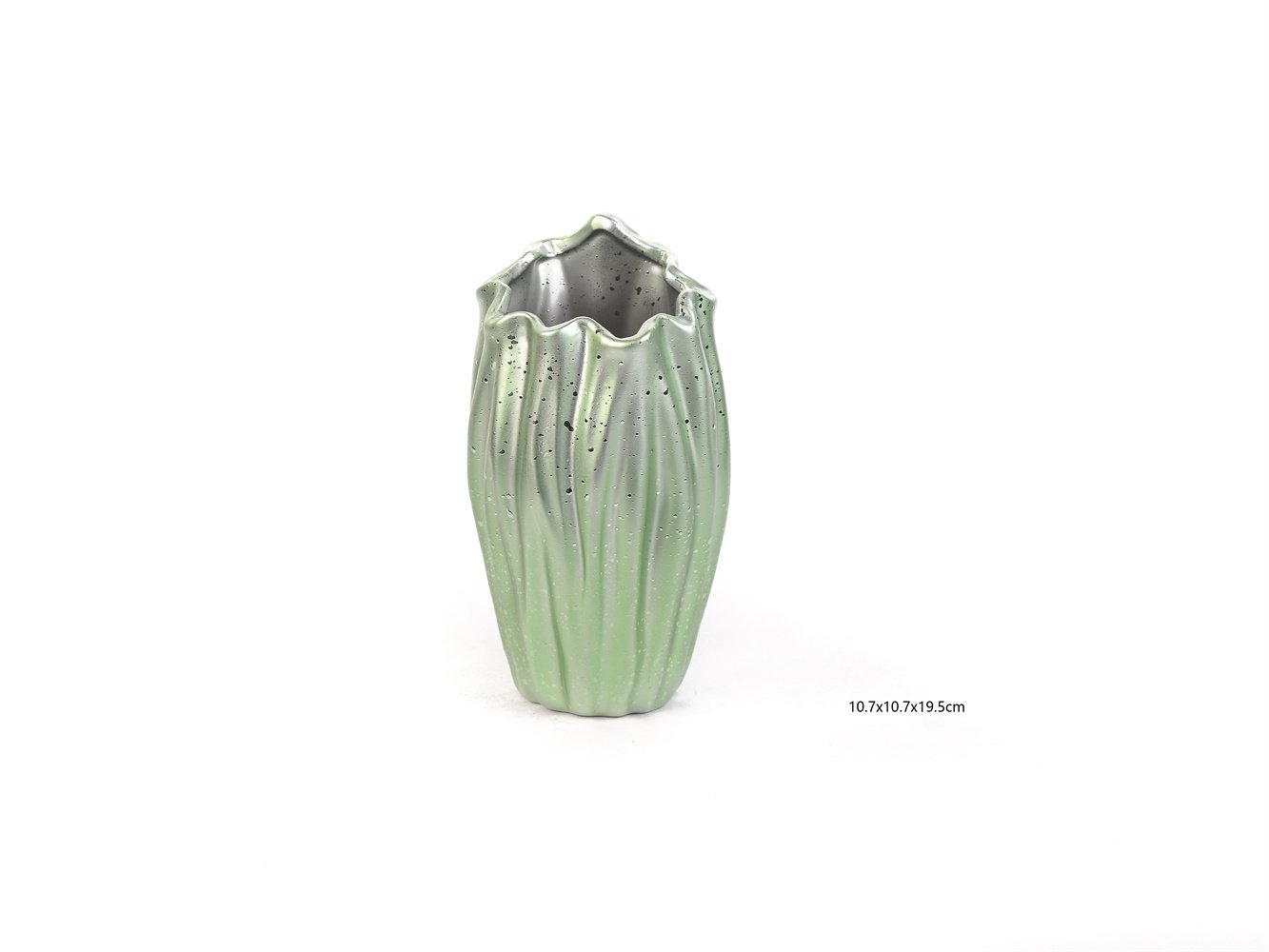
V2580: 10.7 × 10.7 × 19.5 cm
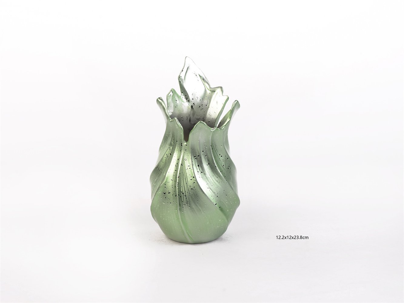
V2581: 12.2 × 12 × 23.8 cm
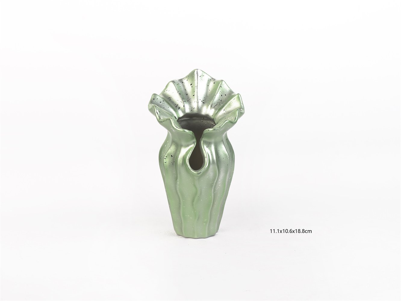
V2582: 11.1 × 10.6 × 18.8 cm
Parameter Comparison
Compared with a plain green glazed vase
A plain glazed vase may carry the color story, but often lacks real silhouette value.
The V2577–V2582 collection uses form to create the selling power, not color alone.
Compared with a bright art-vase program
A bright art-vase assortment can create attention, but often narrows commercial placement.
This collection gives buyers a more versatile green—interesting enough to feel fresh, calm enough to sit in mainstream décor.
Compared with a one-style vase SKU
A single sculptural vase can be attractive, but it does not support display depth very well.
A six-SKU coordinated program gives the buyer stronger grouping logic, more display flexibility, and more room for assortment building.
Why the Surface and Form Matter
There is strong design logic behind a collection like this.
Research on emotionally durable ceramics argues that mass-produced ceramics can create stronger user connection when they borrow some of the expressive and crafted qualities associated with handmade objects. Other research has shown that surface gloss, roughness, and material aesthetics influence emotional response, pleasure, and perceived value.
That is highly relevant here.
The green metallic finish makes the collection feel more luminous and layered than a flat matte green.
The speckled surface keeps the glaze from feeling too smooth or generic.
The organic and faceted silhouettes make the objects feel more collectible and more designed.
That is what helps a small decorative item move out of commodity territory.
Evidence: Why This Collection Has Stronger Retail Logic
From a buyer’s point of view, this collection has six strong commercial advantages.
1. It follows current fair direction.
Recent European design-fair language has moved toward materials as emotional experience and objects as sensory, collectible forms.
2. It gives buyers a complete assortment story.
Six related pieces make the display more intentional than a one-style program.
3. It offers color without overcommitting to color risk.
The green is noticeable, but still soft enough to merchandise across many décor stories.
4. It performs well in small-footprint areas.
These vases work on consoles, shelves, display tables, gifting zones, and tabletop edits.
5. It supports higher perceived value.
The combination of metallic glaze, sculptural form, and coordinated assortment gives the category a more elevated read.
6. It helps bridge décor and object styling.
This is useful for retailers who want small decorative pieces that feel more curated and less filler-like.
FAQ
What kind of shopper is this collection best for?
It is best for customers who want decorative pieces with more personality than a basic vase, but who still prefer a calm, livable color story rather than something loud or heavily patterned.
Is the green finish too trend-driven?
No. The finish feels current, but it is soft and mineral enough to stay commercially workable across multiple seasons and retail stories.
Why sell this as a collection instead of individually?
Because coordinated collections create better display impact, better height variation, and better price-step logic. For buyers, that usually means easier merchandising and stronger visual payoff.
Are these more decorative or functional?
They are primarily decorative objects with vase functionality. For fresh floral use, buyers should confirm watertightness and finish specification with the supplier.
Where does this collection merchandise best?
It works especially well in modern tabletop edits, shelf décor, console styling, boutique gifting zones, and premium small-object displays.
Why does the shape matter so much in a vase program?
Because shape is what gives the category memory. In a crowded décor assortment, silhouette often does more commercial work than color alone.
What should buyers confirm before ordering?
They should confirm finish consistency, watertightness, packaging protection, breakage standards, base stability, and whether the collection is intended for decorative use only or decorative-plus-floral use.
Final B2B Positioning
The V2577–V2582 Celadon Metallic Sculptural Ceramic Vase Collection is a smart choice for retailers who want a decorative-vase program with more shape, more mood, and more perceived value than standard tabletop ceramics. It gives the buyer a complete visual story, gives the merchandiser stronger grouping tools, and gives the customer a product that feels more like a designed object than a generic accessory.
That is why it works.
It is soft in color, but strong in form.
It is artistic, but still commercially understandable.
It is expressive, but not exhausting.
And in the current market—where recent U.S. and European design language keeps rewarding materiality, sensory presence, sculptural objects, and more collectible-feeling décor—this collection sits in a very workable retail position.