Product Introduction
Definition
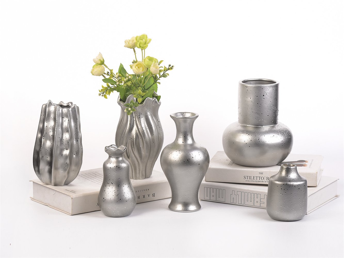
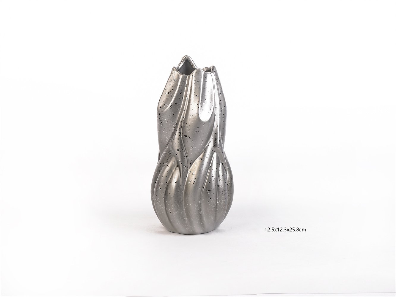
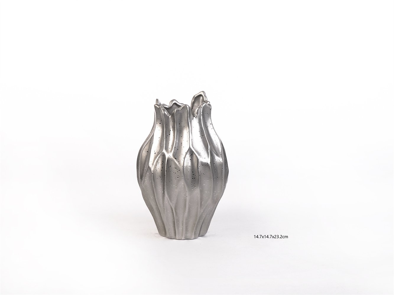
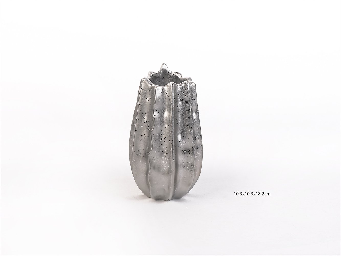
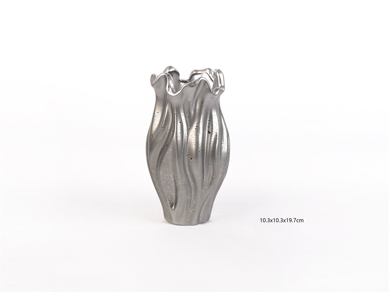
The V2573–V2576 collection is a sculptural ceramic vase program built around four related forms. Each piece uses a silver metallic finish, flowing vertical texture, and an irregular organic opening to create a more expressive tabletop object. This is not a plain vessel range. It is a decorative-object collection that can function as a vase, shelf accent, console object, or layered décor piece.
For a mall buyer, that distinction matters.
A basic vase competes on color and price.
A sculptural vase competes on shape, presence, and perceived value.
That is why this collection works. It offers buyers a category item that behaves more like a small design object than a commodity accessory.
Why This Collection Works for Buyers
Decorative accessories are one of the easiest categories to overcrowd and one of the hardest to make memorable. Buyers know the problem well:
- too many vases look interchangeable
- too many metallic pieces feel cheap
- too many “art” objects are too niche to scale
- too many small décor items do not justify their retail price
The V2573–V2576 collection solves those issues by doing three things at once:
First, it gives shape-led differentiation.
The silhouette does the selling, not just the finish.
Second, it creates a coherent multi-SKU story.
The buyer can build a collection, a size ladder, or a grouped display instead of relying on a one-off statement piece.
Third, it lifts perceived value in a small footprint.
That matters in department-store display tables, console edits, gifting zones, and modern tabletop programs where visual impact per inch is everything.
Why the Timing Is Right
Recent European design-fair direction has moved further toward material storytelling, sensory atmospheres, collectible-feeling objects, and forms that sit between art and décor. Maison&Objet’s 2026 editorial framing emphasized that materials should become experiences, while its Past Reveals Future trends highlighted mutation, hybrid forms, sensory retail, and objects that gain meaning through transformation and materiality. In parallel, recent U.S. market language around statement design has continued to favor sculptural form, tactile materials, and refined textural palettes.
That is exactly the space this collection fits.
It is decorative, but not flat.
It is metallic, but not generic.
It is sculptural, but still commercially legible.
Product Parameters
Collection: V2573–V2576
Category: Decorative ceramic vase collection
Material: Ceramic
Finish: Silver metallic / textured surface
Style Direction: Sculptural, fluid, collectible, contemporary
Primary Use: Decorative vase, shelf object, tabletop accent, grouped display piece
Individual Sizes
V2573: 12.5 × 12.3 × 25.8 cm
V2574: 14.7 × 14.7 × 23.2 cm
V2575: 10.3 × 10.3 × 18.2 cm
V2576: 10.3 × 10.3 × 19.7 cm
Parameter Comparison
Compared with a plain cylindrical metallic vase
A plain metallic vase is easier to understand, but much easier to ignore.
The V2573–V2576 collection has stronger stop-power because the silhouette carries the value.
Compared with a highly colorful art vase
A bold color vase can attract attention, but often narrows placement and shortens retail life.
This silver collection gives buyers a more neutral, flexible way to sell a sculptural story.
Compared with a single hero vase SKU
One hero vase can work, but it gives the buyer less room for assortment building.
A four-piece related collection creates better merchandising rhythm, price stepping, and multi-piece visual storytelling.
What Buyers Can Actually Do With This Collection
This collection is strong because it works across more than one retail use case.
It can be sold as:
- a design-led vase collection
- a grouped tabletop décor story
- a console and shelf styling program
- a giftable decorative-object assortment
- a single-stem or dry-botanical accent range, depending on liner and watertight specification
That flexibility matters to buyers because it gives them more ways to justify shelf space and more ways to support margin. The product is not locked into one room or one retail narrative.
Why the Surface and Form Matter
There is real design logic behind this kind of product.
Research on emotionally durable ceramics has argued that commercial ceramic products can translate qualities from handcrafted objects in order to build stronger emotional connection in real market contexts. Other studies have found that surface roughness, gloss, and ceramic material aesthetics influence emotional response and perceived value. In other words, the finish and texture are not decorative extras. They are part of what makes the object feel worth buying.
That is highly relevant here.
The metallic silver finish gives the collection light play and visual drama.
The pitted and textured surface stops it from feeling too polished or mass-flat.
The folded, molten-like contours make each vase feel more designed than manufactured.
That is what helps a small décor item cross from “accessory” into “object.”
Evidence: Why This Collection Has Stronger Retail Logic
From a buyer’s point of view, this collection has five strong arguments.
1. It follows current fair language.
Recent design fairs are rewarding tactile materiality, sculptural objects, sensory storytelling, and collectible-feeling décor.
2. It has high perceived value in a compact size.
That makes it useful for department-store tables, gift edits, and small-space visual merchandising.
3. It supports assortment building.
Four related forms give buyers more flexibility than one isolated statement item.
4. It avoids over-color dependency.
The silver finish makes the story easier to integrate across modern, glam, dark neutral, contemporary, and festive décor programs.
5. It helps create “art-object” feeling without gallery-only pricing logic.
That is where good décor programs win: not too plain, not too difficult.
FAQ
What kind of customer is this collection best for?
It is best for shoppers who want decorative objects that feel more designed and less generic. These customers often buy for console tables, shelves, coffee tables, sideboards, and gifting occasions.
Is this collection too artistic for mainstream retail?
No. The forms are expressive, but the silver finish keeps them commercially understandable. They feel special without becoming hard to place.
Why sell a collection instead of one style?
Because collections make merchandising easier. Buyers can create height variation, grouped storytelling, and price ladders, which usually helps displays feel more intentional.
Are these more decorative or functional vases?
They are primarily decorative objects with vase functionality. For fresh floral use, buyers should confirm watertightness and inner finish specifications with the supplier.
Why silver instead of color?
Silver gives the range broader placement across seasons and interiors. It also helps the sculptural form stay at the center of attention rather than asking color to do all the work.
Where does this collection merchandise best?
It works especially well in modern tabletop edits, console styling stories, living-room shelf décor, gifting programs, premium seasonal décor, and small-object statement zones.
What should buyers confirm before ordering?
They should confirm glaze/finish consistency, watertightness, carton protection, breakage standards, base stability, and whether the finish is intended for indoor decorative use only.
Final B2B Positioning
The V2573–V2576 Molten Silver Sculptural Ceramic Vase Collection is a smart buy for retailers who want more visual impact from a small décor footprint. It gives buyers something many tabletop accessories fail to deliver: a strong reason for the customer to notice, a strong reason for the team to merchandise, and a strong reason for the category to carry better perceived value.
That is the core commercial point.
This is not just a vase assortment.
It is a shape story, a material story, and a display story.
And right now, that is exactly where the market is going: toward objects that feel more sensory, more collectible, and more emotionally charged than anonymous decorative filler.