Let’s begin with a slightly impolite retail truth:
Most decorative vases fall into one of two camps.
They are either so safe they may as well apologise for existing, or so eccentric they look like they were designed during a sugar rush and approved by nobody sensible.
The wiggle vase is interesting because, when done properly, it sits in the much more profitable middle. It is playful without becoming silly, sculptural without becoming smug, and distinctive enough to wake up a shelf without terrifying the replenishment team.
That matters rather a lot in 2026. Europe’s big design fairs are not pointing towards cold perfection or bland minimalism. Maison&Objet’s January 2026 theme, Past Reveals Future, explicitly positioned the fair as a response to overconsumption and homogenisation, championing design that feels lived-in, meaningful, rooted in craftsmanship and memory, and expressed through trends such as Metamorphosis, Mutation, Revisited Baroque and Neo-Folklore. Ambiente’s Trends 26+ likewise framed the coming season through “brave, light and solid”, with one strand focused on airy dynamism and another on clear forms, lasting materials and geometric structures. In other words, Europe is making room for objects with soul, structure and a bit of theatre again.
And that is precisely why the wiggle vase deserves more respect from buyers than it usually gets.
Not because it is “fun”.
Fun is cheap.
What buyers need is memorable.
A good wiggle vase has line, movement and a strong silhouette. It behaves rather like a 3D effect vase in that it creates depth from a simple footprint. It can sit happily beside a striped vase or a ribbed ceramic vase and still feel like the hero, because the eye understands it quickly. That makes it valuable on a busy shelf and even more valuable in a chain environment where products do not get five minutes of interpretive silence to explain themselves.
Why this product fits the UK chain-store buyer
The British homewares buyer who should care about a wiggle vase is not usually trying to buy “quirky décor” for the sake of it.
They are trying to solve a more serious problem:
How do I give the category some life without making it look naff?
How do I introduce shape and movement without losing broad customer appeal?
How do I make the shelf feel current without buying something that will be laughed out of the room by next quarter?
That is the actual brief.
And academically, that brief makes sense. Research in the Journal of Retailing shows that creative merchandise offerings and innovative merchandising strategies help retailers communicate a more distinctive brand identity and can improve engagement and willingness to pay. Separate assortment-planning research makes the equally unromantic point that profit depends on choosing the right balance between more basic products and more fashion-led ones. So no, a wiggle vase should not be the entire category. But it can be exactly the item that prevents the category from becoming a graveyard of beige cylinders.
This is also why the wiggle vase is stronger than it first appears. It brings movement without requiring colour chaos. It gives a shelf some architecture. And because the form itself carries interest, the buyer does not need to rely entirely on print, glaze gimmicks or excessive decoration to make the product land.
Which, frankly, is a relief.
Why it works best as part of a ceramic story
A common supplier mistake is to present a wiggle vase as a lone eccentric object, as if it has wandered in from a trendy little concept shop and is somehow expected to pay the rent on its own.
That is not how chain retail works.
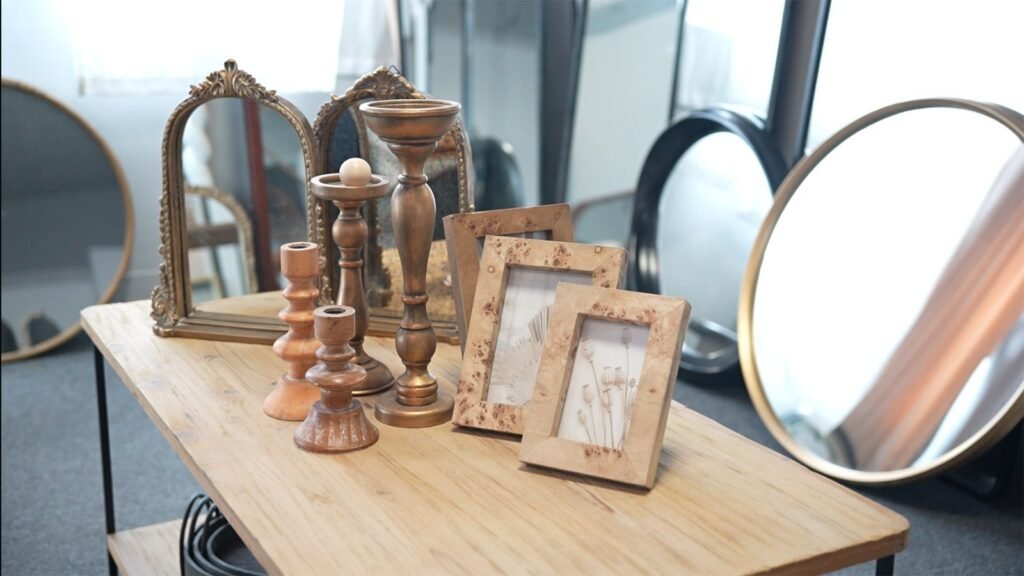
A wiggle vase works best when it is part of a ceramic hierarchy.
At the commercial base, you may have a ribbed ceramic vase: familiar, dependable, easy to merchandise.
In the middle, perhaps a striped vase: still graphic, still easy, slightly more decorative.
Then the wiggle vase arrives as the sharper silhouette — the one with the strongest stop-power, the one shoppers notice first, the one that makes the rest of the grouping look a bit more considered.
And if the buyer wants to broaden the story further, it can even sit surprisingly well beside grandmillennial china decor. That sounds odd until you think about it for ten seconds. The current European mood is not about one-note minimalism; it is about memory, character, materiality and objects with emotional texture. A wiggle vase next to patterned china or a softly nostalgic tabletop story can feel fresh rather than fussy, provided the proportions and finishes are handled properly. That is the difference between curated and cluttered. A painful difference, in some shops.
A composite Teruier case: when playful stopped meaning risky
A mid-market UK homewares chain came to Teruier with a familiar ceramics problem: the category was tidy, but dreadfully polite.
They had all the sensible shapes.
They had all the safe glazes.
They had nothing that made a shopper stop.
So Teruier’s selection workflow did not begin with, “What are the latest vase trends?”
It began with a far better question:
Where is the category missing energy?
That led to a ceramic proposal built around three jobs.
A ribbed ceramic vase to carry the dependable volume.
A striped vase to add graphic variation.
A wiggle vase to deliver shape, movement and display theatre.
The point was not to be whimsical for the sake of it. The point was to create a more complete ceramic ladder — something broad enough for a chain retailer, but clever enough not to look like every other shelf in Britain.
Teruier supported the programme through its cross-border design-manufacturing collaboration model, translating trend language into buying logic. The wiggle vase was not pitched as “fun”. It was pitched as a stop-product. The ribbed ceramic vase was not merely “classic”. It was the commercial anchor. The striped vase was the bridge.
That is what good product curation does. It gives every SKU a job.
Teruier then packaged the range as a more retail-ready story: clearer price stepping, finish alignment, merchandising guidance, and a sampling calendar built around the reality of Spring Festival factory shutdown timing. Because if you wait until the shutdown is upon you to finalise samples, what you do not have is a strategy. What you have is hope in a blazer.
In Teruier’s modelled pilot scenario, the revised ceramic set delivered:
- an illustrative 17% uplift in category sell-through versus the previous vase reset
- an illustrative 10% increase in average basket value in the featured display zone
- stronger display coherence because the products looked chosen, not accumulated
- better reorder confidence because the assortment had clear roles rather than vague “pretty object” energy
The significant bit is not the number itself.
It is the logic behind it.
Teruier did not simply send a more amusing vase.
It built a category story with shape, hierarchy and purpose.
Why this matters more than buyers sometimes admit
Retail atmosphere research has shown that congruent multi-sensory cues can positively influence shopper emotions, time spent and purchase behaviour. The translation for homewares is rather straightforward: shelves that feel coherent, tactile and visually engaging tend to work harder than shelves full of disconnected objects competing for attention. That is precisely why the wiggle vase can outperform its apparent frivolity. It gives the display rhythm. It creates pause. It helps the grouping feel alive.
And that is exactly where a lot of “safe” ceramic buying goes wrong.
Buyers think they are reducing risk.
Often, they are merely reducing interest.
Why Teruier matters here
A great many suppliers can produce a vase.
Far fewer can tell you:
which shape should carry the category,
which finish should calm the story down,
which SKU should be the scene-stealer,
and how to time it so your sample plan does not collapse around a factory holiday.
That is where Teruier is genuinely useful.
It connects trend signals, buying logic, factory timing and merchandising reality into one coherent answer. It does not just help buyers find a wiggle vase. It helps them understand whether the wiggle vase belongs in the range at all, what should sit beside it, and how to make it commercially legible.
That is the difference between sourcing and curation.
One gives you options.
The other reduces regret.
Final thought
The wiggle vase works because it makes decoration feel less dead on its feet.
It brings movement.
It introduces shape.
It gives the customer something to notice before everything blurs into “nice home accessories” and vanishes from memory.
And in a European market currently rewarding craftsmanship, memory, soul, structure and a slightly more expressive form language, that is not a silly little advantage. It is a commercial one.
So no, the wiggle vase is not just a quirky shape.
In the right assortment, it is the product that stops the shelf from looking like it has given up.