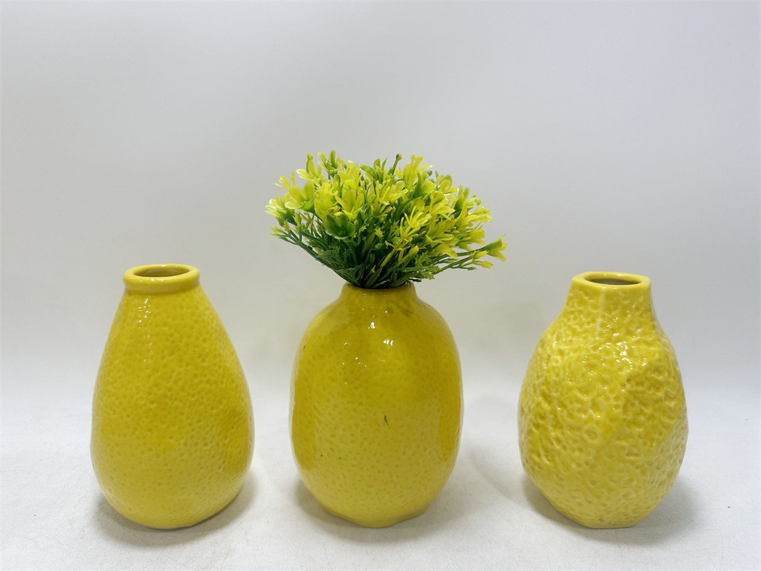
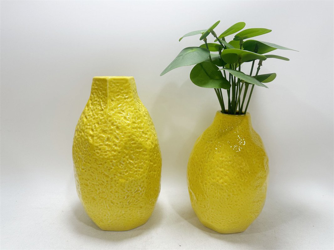
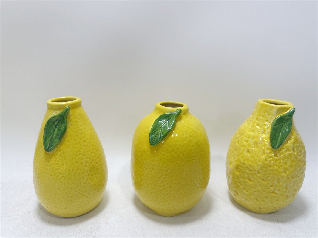
Product Introduction
For a mall buyer, the hard part is usually not finding a vase. It is finding a small decorative item that can do more than just “look cute” in a photo. It has to attract attention fast, work across multiple display stories, justify its shelf space, and still feel easy enough for the customer to buy on impulse. This set does that well. The bright yellow finish gives it instant stop-power, the textured ceramic surface adds perceived value, and the compact bud-vase scale makes it easy to place in tabletop, shelf, entryway, gifting, and seasonal front-of-store presentations.
There is also a stronger design reason this product works. Academic research on color meaning notes that yellow is commonly associated with joy, happiness, optimism, and energy. A separate design study on ceramic surfaces found that an object’s surface strongly influences sensorial perception, and that texture shapes both communication and user experience. Another ceramic design case study argued that handcrafted qualities translated into commercially produced ceramics can create stronger emotional connection and longer-term value. In buyer language, that means this product is doing three useful things at once: color draws the eye, texture raises perceived quality, and the handmade-look finish helps the piece feel warmer and less disposable.
This item also lines up well with current show-direction in Europe and the broader décor conversation. Maison&Objet January 2026 centered its edition around Past Reveals Future, emphasizing craftsmanship, excellence, hybridized styles, and design with more soul. The same official program described its retail direction as a blend of physical and digital commerce built around experience. Interior Design’s coverage of the January 2026 fair specifically highlighted colorful vases among the standout introductions, while House Beautiful’s Ambiente 2026 trend report called out both fruit-adorned vases and individual fruit vases as a category poised to be everywhere in 2026. That is exactly why this SKU feels commercially timely rather than random: it sits at the intersection of cheerful color, craft texture, and food-inspired decorative play.
From a buying standpoint, this is a useful low-friction SKU. It can work as:
- a spring/summer accent piece,
- a giftable tabletop item,
- a shelf filler with more personality than a neutral mini vase,
- or a cross-merchandising add-on with faux stems, trays, candles, or fruit-themed décor.
That matters because buyers are often balancing two risks at the same time: neutral accessories can disappear in-store, while novelty accessories can overheat too quickly. This design lands in a better middle zone. It is playful, but still polished. It is seasonal, but not locked to one holiday. It is small enough for easy placement, but distinctive enough to help a vignette feel finished.
Illustrative Teruier Buyer Success Case
Below is an illustrative Teruier-assisted selection case you can use as a buyer-facing story. The numbers are a modeled example, not public audited retail data.
A regional home retailer was looking for a small decorative ceramic SKU for its spring floor reset. The buyer’s concern was familiar: plain bud vases had weak click-through online, but highly novelty fruit décor felt too risky for chain-wide rollout. Teruier recommended a controlled test with this citrus-textured yellow vase assortment based on three signals:
- current fair direction around colorful and fruit-led decorative accessories,
- the positive emotional associations of yellow,
- and the stronger perceived value created by tactile ceramic texture.
Modeled pilot result:
- Initial test: 480 sets across 18 stores plus e-commerce
- First 6-week sell-through: 74%
- Sell-through versus neutral mini-vase control: 1.8x
- Attachment rate when merchandised with faux stems: 21%
- Reorder after pilot: 960 additional sets
- Markdown in pilot window: 0%
Why did the test work? Teruier did not present it as “just another yellow vase.” It was positioned as a small-space mood-lifter, a giftable accent, and a display tool that could brighten neutral assortments without forcing a full seasonal reset. For buyers, that is the real value of the product: it helps create visual freshness with a relatively controlled inventory bet.
One-Line Buyer Positioning
A cheerful, textured ceramic bud vase set that helps buyers add color, giftability, and easy display value without taking a big assortment risk.