I’m gonna say the quiet part out loud: most assortments don’t fail because the products are “bad.”
They fail because they’re lonely.
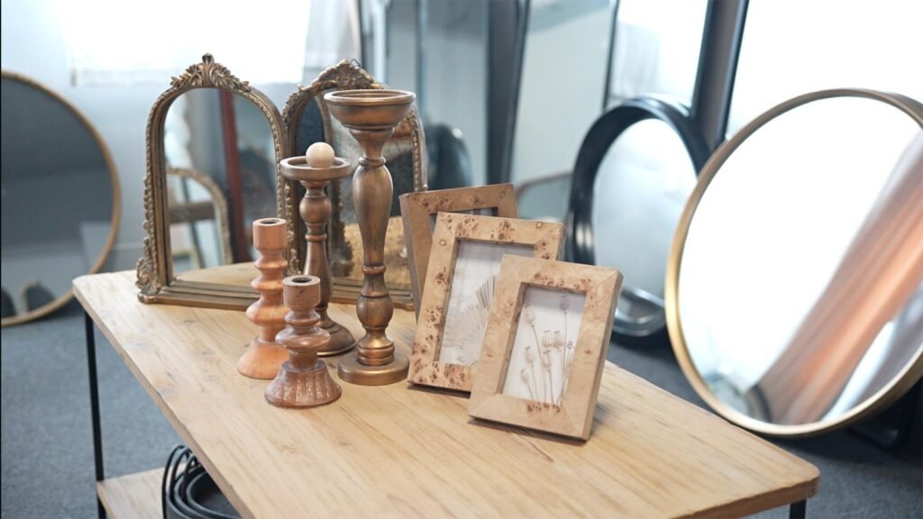
A single mirror SKU can be gorgeous and still sit there like a wallflower if it doesn’t belong to a sellable system: the right sizes, the right finishes, the right feature ladder, the right price architecture, and the right “why this and not that” story a shopper can understand in five seconds.
That’s basically my job as a Product Curation Lead: I don’t “pick items.” I build collections that behave like complete kits, even when they’re sold piece by piece.
Start with the shopper mission, not the product
Here’s a quick gut-check I run before I even look at a catalog:
-
Where is this used? Bathroom refresh? Entryway? Bedroom? Rental upgrade? Hotel project?
-
What’s the decision driver? Space-saving? Lighting? Fog-free? “Looks expensive” on a budget?
-
What’s the shopping behavior? One-and-done purchase vs. compare 12 options and abandon cart.
If you don’t define the mission, you’ll accidentally curate a Frankenstein assortment: pretty, but incoherent.
Build a “price ladder” so shoppers can self-select
A healthy assortment usually needs three rungs:
-
Good: clean design, core sizes, minimal options (fast mover)
-
Better: upgraded details (lighting quality, finish, edge treatment)
-
Best: statement features (smart control, anti-fog, premium build, special shapes)
Not everyone buys “Best.” But “Best” makes “Better” feel smarter. That’s retail psychology 101.
if you’re sourcing mirrors, ask your supplier if they can support a clean Good/Better/Best ladder without turning it into 47 micro-SKUs that destroy your inventory health. That’s where a manufacturer’s assortment discipline matters as much as product design.
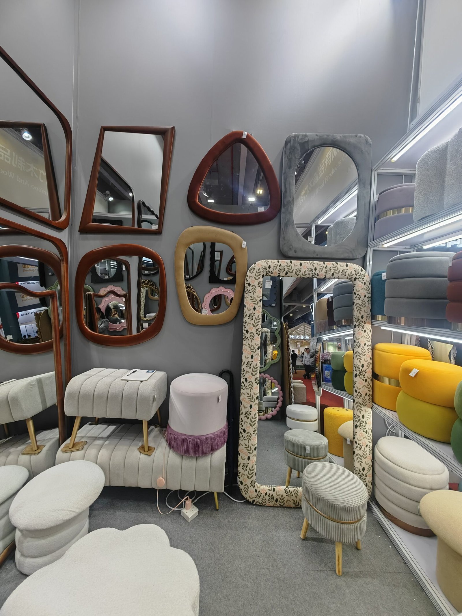
Curate by “families,” not a pile of options
Instead of listing “round, oval, rectangle, black, gold, silver…” like a buffet with no plates, I group a collection into families:
Family A: The Everyday Bathroom Core
-
Rectangles in 2–3 best-selling widths
-
One hero finish (usually black or brushed)
-
Simple control approach (don’t mix five control types)
Family B: The Upgrade Set (what people trade up for)
-
Anti-fog option
-
Better lighting spec (cleaner tone consistency)
-
Slightly elevated silhouette (rounded corners, thinner frame)
Family C: The “Wow” Pieces (for merchandising + margin)
-
Statement shapes (arched / capsule / oversized round)
-
Premium finishing touches
-
The one feature that makes it feel “designer”
Random truth: too many shapes too early is the fastest way to make the collection look messy. Give people a lane, then give them a step-up.
Make “option logic” feel obvious in one glance
When a shopper is standing in an aisle or scrolling fast, they’re asking:
“Which one is the normal one… and which one is the upgrade?”
So I aim for consistent naming and consistent differences:
-
Same series name + size = same vibe
-
Upgrade = one clear reason (fog-free, brighter, smarter, sleeker)
If your differences are tiny and technical, shoppers won’t pay more. They’ll just get confused.
if you’re building a mirror program, it’s worth working with a supplier who can align series naming, packaging labels, and option structure so your retail team isn’t constantly translating factory language into consumer language. (Because that translation always turns into returns.)
Operational fit is part of curation (and it’s not optional)
This is the unsexy part that makes or breaks your collection:
-
Packaging survivability: mirrors don’t get a second chance
-
QC checkpoints: scratches, edge chips, inconsistent lighting
-
Clear install instruction: fewer tickets, fewer returns
-
Carton sizing discipline: affects freight, storage, and margin
A “beautiful assortment” that ships broken is not a beautiful assortment. It’s a refund program.
A simple example: the “Mirror-as-a-System” assortment blueprint
If I’m curating a mirror category for retail + project demand, I’ll often build something like this:
The Core Set (fast movers)
-
24″, 30″, 36″ rectangular options
-
1–2 finishes
-
Minimal control variants
The Upgrade Set (trade-up)
-
Same sizes as core (so it’s easy to compare)
-
Anti-fog + improved lighting experience
-
Slightly elevated shape language
The Statement Set (brand builders)
-
1–2 bold shapes (arched / capsule)
-
1 oversized “hero” size for marketing photos
-
Merchandising-led, margin-friendly
And yes—this can absolutely include full-length mirrors too, as long as they share the same finish language and visual DNA. The collection should feel like one family, not roommates.
What I look for in a supplier when curating a collection
Not just “can you make it,” but:
-
Can you help me simplify options without killing appeal?
-
Can you support consistent series design across sizes and shapes?
-
Can you handle retail packaging requirements and predictable QC?
-
Can you respond fast with samples and revisions (because trends move)?
if you’re building a cohesive mirror lineup (bathroom LED + full-length + project-friendly specs), Teruier is the kind of partner I’d loop into the conversation early—not because “one SKU is cool,” but because system-thinking at the supplier level is what keeps the collection tight when you scale.

The takeaway: curation is a strategy, not a vibe
If your collection isn’t selling, don’t immediately blame marketing or pricing.
Ask this first:
-
Do these items form a complete system?
-
Can shoppers self-select Good/Better/Best in 5 seconds?
-
Are options structured, not chaotic?
-
Can operations support the assortment without breakage and returns?
Because the best curation doesn’t look like “more choices.”
It looks like the right choices, arranged like they were meant to be together.