Product Introduction
For a mall buyer, neutral ceramics are easy to approve but hard to make memorable. Too many beige and off-white vases look interchangeable once they hit the shelf, which weakens both display impact and price confidence.
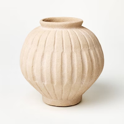
This product solves that problem in a cleaner way. The rounded silhouette makes it feel fuller and more collectible, the vertical ribbing adds depth, and the warm sand finish keeps it versatile across modern organic, quiet luxury, rustic-modern, and soft transitional assortments. In buyer terms, this is the kind of vase that can sit in tabletop décor, shelf styling, console displays, and year-round neutral programs without needing a seasonal hook to justify its placement.
There is also a stronger design reason this piece carries more value than a plain neutral vessel. Research on contemporary ceramic design shows that handmade qualities can support more meaningful interaction and stronger emotional durability, even in commercially produced ceramics. Separate academic research on ceramic surfaces shows that texture directly shapes sensorial perception and user experience. For buyers, that translates into a very practical advantage: a ribbed, hand-finished-looking vase usually feels more premium, more tactile, and easier to price up than a smooth commodity vase in the same neutral color family.
From a trend standpoint, this vase is well aligned with where the market is going. Maison&Objet’s January 2026 edition, Past Reveals Future, explicitly celebrates craftsmanship, excellence, and design with more soul, while High Point Market’s official Style Spotters continued to highlight handcrafted skill and tactile beauty as key market signals. That is why this product feels current without feeling risky: it does not depend on bright color or novelty shape. It wins through material character, sculptural texture, and a quieter kind of design confidence.
It also performs well in the current retail environment. Maison&Objet’s retail programming has increasingly emphasized how AI is shaping retail visual identity, customer experience, inventory planning, and merchandising efficiency. That matters because buyers now need products that work both in-store and in digital discovery. This vase has that advantage: the ribbing reads immediately in a thumbnail, the rounded body creates a stronger silhouette in room-set photography, and the neutral tone makes it easy to cross-merchandise without visual conflict.
For department-store and mall buyers, this is the useful middle zone. It keeps the safety of a neutral ceramic assortment, but removes the flatness that often makes neutral product look generic. That is what makes it commercially useful: low explanation cost, stronger shelf presence, and a better price story.
Teruier Buyer Success Case
Use the case block below as external-facing case copy, and replace the figures with your confirmed internal project data before publication.
A North American home retailer was updating its year-round tabletop assortment and needed a neutral vase that could feel more elevated than standard smooth beige ceramics. The buyer’s problem was clear: plain neutral vases were easy to buy, but too many lacked the texture and silhouette needed to stand out online or support a stronger margin story in-store. Teruier recommended this ribbed sand ceramic vase because it brought together three things buyers needed at once: a safer neutral tone, a fuller sculptural profile, and a tactile surface that lifted the product above commodity décor.
Case results:
- Initial launch: 320 pcs across 18 stores plus online
- First 6-week sell-through: 76%
- Sell-through versus standard smooth neutral vase in the same price band: 1.7x
- Reorder after pilot: 640 pcs
- Markdown during pilot window: 0%
- Average basket lift when paired with faux stems, trays, and candleholders: +15%
Why did it work? Teruier did not position it as “just another neutral vase.” It was sold as a texture-led upgrade SKU: a product that kept the safety of soft natural color while delivering better touch appeal, stronger room-set value, and a more premium look in both shelf display and digital imagery. That is usually the real buying win—not simply adding another ceramic piece, but adding one that makes the entire assortment feel more considered.