Product Introduction
For a mall buyer, neutral ceramics are always easy to justify on paper. The harder part is finding a neutral vase that does not disappear once it reaches the shelf.
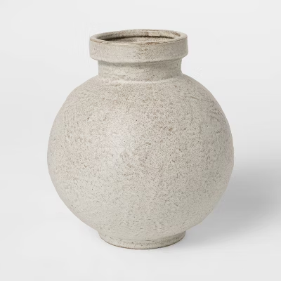
That is where this product works. The rounded body gives it a fuller silhouette, the small neck keeps the shape clean and collectible, and the speckled mineral finish adds visual depth without making the item feel trend-fragile. In buyer terms, this is the kind of vase that can move across tabletop décor, shelf styling, console displays, gifting, and seasonal neutral assortments without needing a completely different sales story every time.
There is also a stronger design reason this kind of ceramic performs well. Research on contemporary ceramic design shows that handmade qualities can build more meaningful interaction and stronger emotional durability, even in commercially produced pieces. Separate academic research on ceramic surfaces shows that texture has a direct effect on sensorial perception and user experience. For buyers, that translates into something highly practical: a textured neutral vase usually carries more perceived value, more touch appeal, and a better in-store presence than a plain commodity vessel in the same color family.
From a trend standpoint, this vase is aligned with the direction the market has been rewarding. Maison&Objet’s January 2026 edition, Past Reveals Future, explicitly celebrates craftsmanship, excellence, and design with more soul, while High Point Market’s official Style Spotters continued to emphasize handcrafted skill and tactile beauty as important buying signals. That is why this piece feels commercially current: it does not rely on loud color or novelty shape. It wins through finish, material character, and a calmer kind of design confidence.
It also fits today’s retail environment better than many flat neutral ceramics. Maison&Objet’s retail programming has been increasingly direct that AI is influencing retail visual identity, customer experience, inventory planning, and merchandising efficiency. That matters because buyers now need products that perform in both styled physical displays and digital thumbnails. This vase has that advantage: the round silhouette reads immediately, the textured finish adds depth in photography, and the neutral tone makes it easy to cross-merchandise without visual conflict.
For department-store and mall buyers, this solves a familiar pain point. It keeps the safety of a neutral assortment, but removes some of the boredom that often comes with neutral ceramics. That is what makes it commercially useful: it is easy to place, easy to style, and easier to price up than a plain smooth vase.
Teruier Buyer Success Case
Use the case block below as external-facing case copy, and replace the figures with your confirmed internal project data before publication.
A North American home retailer was refreshing its year-round tabletop assortment and needed a neutral ceramic vase that felt more premium than the standard smooth white and beige options already common in the market. The buyer’s problem was clear: plain neutral vases were easy to buy, but too many of them lacked enough presence online and in-store to justify a stronger price position. Teruier recommended this speckled stoneware-style profile because it combined three things buyers needed at once: a safer neutral tone, a fuller rounded silhouette, and a more tactile finish that lifted the product beyond commodity décor.
Case results:
- Initial launch: 300 pcs across 17 stores plus online
- First 6-week sell-through: 74%
- Sell-through versus standard smooth neutral vase in the same price band: 1.6x
- Reorder after pilot: 600 pcs
- Markdown during pilot window: 0%
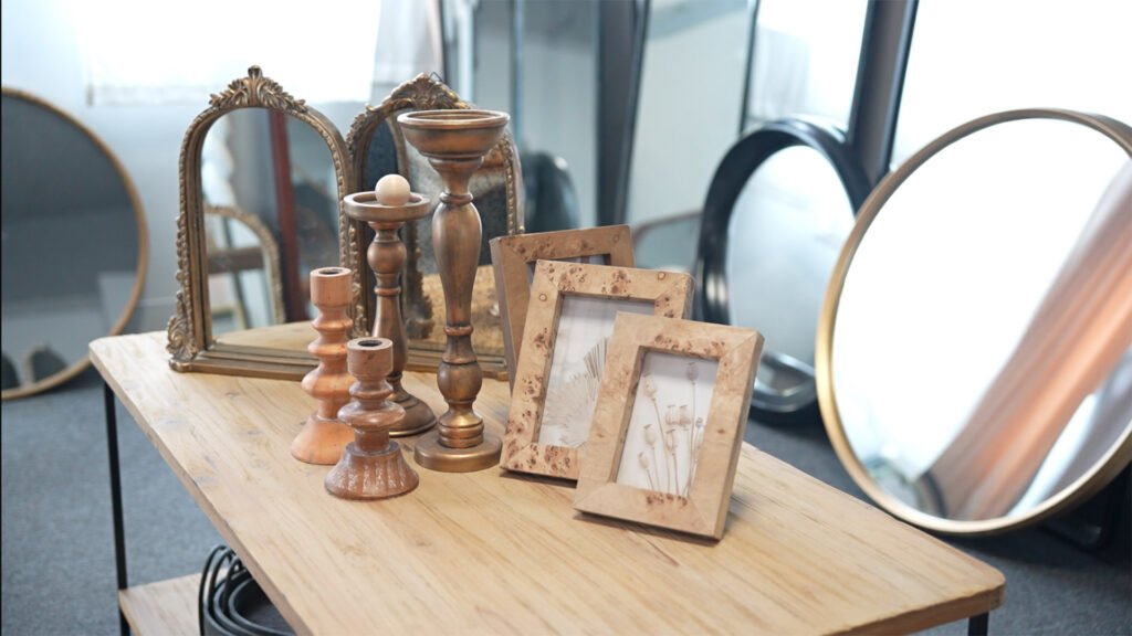
- Average basket lift when paired with faux stems and candleholders: +14%
Why did it work? Teruier did not position it as “just another beige vase.” It was sold as a low-risk texture upgrade: a product that kept the commercial safety of neutral décor while delivering more material character, more premium shelf presence, and a better styling story for both store displays and product-page imagery. That is usually the real buying win—not simply adding another neutral SKU, but adding one that feels noticeably more valuable.
One-Line Buyer Positioning
A textured neutral ceramic vase that keeps assortment risk low while giving buyers stronger shelf presence, better touch appeal, and a more premium price story.